Renfrew the Raccoon is a character in a graphic novel I’m working on with author Elizabeth Ann Scarborough, and as I’m just about to start on the full-sized drawings, I invited Renfrew to help me test some different papers. I’ve added some links to the papers, and to the previous parts of my experiment.
I’ve not been entirely satisfied with the usual bristol for my comics, because I like to do the colouring with watercolour. While the bristol paper is smooth, sturdy, and good for drawing in ink, it is not ideal for watercolour — the colour gets sucked up by the paper immediately and doesn’t allow much pushing around of the pigment, and it’s hard to lift out areas that are mistakes (of course I never make those!) or where I want a soft highlight.
On the other hand, my usual watercolour paper, Arches 140 lb cold press, is too bumpy for comfortable inking. So I set out to find a paper that would answer both needs — the ability to make a smooth, predictable ink line with either pen or brush, and the ability to act as a good watercolour paper. The paper needed to be relatively smooth, sturdy enough to take the abuse of erasing the pencil sketch, lifting paint, multiple layers of washes, and heavy enough not to buckle too much.
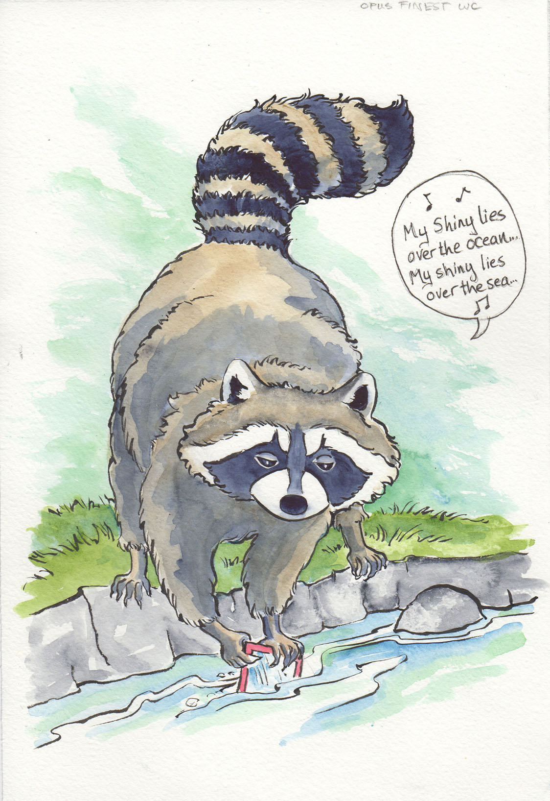
I went to the local art supply store, Opus, and put my question to the staff (who are always very knowledgeable and seem to view such inquiries as a pleasurable challenge!). We selected a few papers to try, and I bought a sheet of each of four different types: Arches 90 lb hot press, and three of Opus’ own papers: Opus Student Watercolour, Opus Finest Watercolour, and Opus Watermedia, all 140 lb cold press. I also have a pile of Rising’s Stonehenge paper at home, so added that to my experiment. The Stonehenge experiment, which I did first, was assisted by the lovely lady Sasquatch in the story.
Yesterday I did some sketches of Renfrew the Raccoon and inked them with India ink and a brush, and was very pleased to find that all the papers were wonderful to ink — none of them were too bumpy, so I was not distracted by or fighting with the texture on any of them. Today I did the part of the experiment that would enable me to make my decision. It turns out that it is a fairly hard call to make!

The first paper I tried was the Opus Student Watercolour Paper. This is a very inexpensive watercolour paper, and it’s a good value. I’ve used it before and enjoyed the way the paint pushed around on the surface, and was not disappointed this time. It’s very sturdy and did not buckle at all (I did not tape any of these down, because one of the prerequisites is that the paper must have the ability to be worked without taping, so I can turn it around as I work). The lifting ability was very good, in fact, probably the best of any of them. But it’s also the bumpiest, and I had the concern that when it was scanned, the texture might show. It did, but a little photoshop would take care of it — still, that’s an extra step in the processing.
The Opus Finest Watercolour paper was a lovely surprise — I hadn’t tried it before. It has a subtle, fine texture, but not enough to impede the inking of details. The way the paint moved on the surface compared very well with my old standby, Arches 140 lb cold press. I think I am now a convert to this Opus paper for watercolour purposes, and it’s much less expensive than the Arches. However, for my comic, there’s still the issue of a lot of clean-up of scanned texture to deal with — not insurmountable, and if I were doing a shorter work I’d definitely consider it. And it’s more expensive than the other two Opus papers or the Stonehenge.

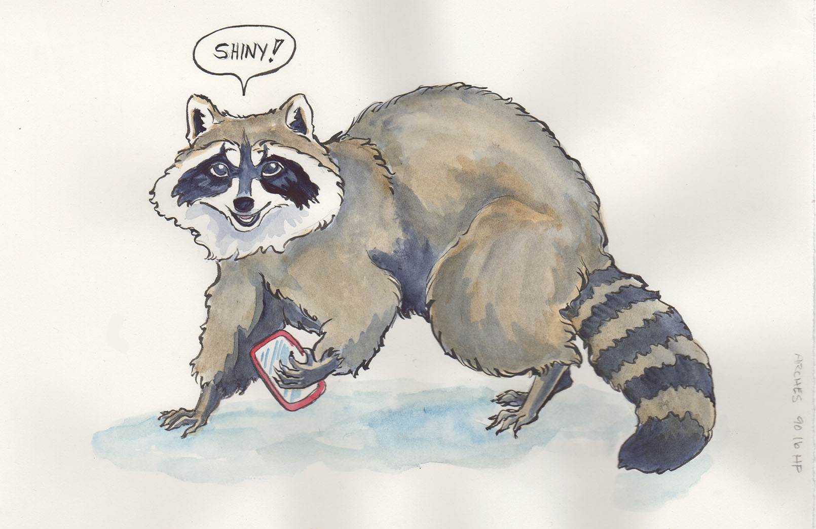
Enter the Opus Watermedia paper. This was a prime candidate for me, because when I got home, I discovered I had almost a whole 25-sheet pack already buried under the Arches paper in my flat files. However, the Opus website says it has recently been redesigned and improved for watercolour, so now I must test that. But luckily, it is on sale right now, so if the older stuff doesn’t compare favourably, I can trot down to the store and get some more, and use the older stuff for drawing.
As for the test results, the Watermedia paper was really nice to work on. It absorbed the paint at just the right rate for me to have some time to work with it, yet didn’t stay wet so long that I had to wait a long time to do more layers. In fact, I really liked the way the paint spread gently over the area I was working, making it easy to do smooth washes — good for comics! The lifting ability was good, though not as much as the Student paper, but I can live with that. I was enjoying this paper so much that I put a lot more paint on it than the others (there went the initial smooth, simple washes!), which meant that it got wetter — and it hardly buckled at all. I think this one is going to be my choice for the graphic novel!
The Arches 90 lb Hot Press was quite different than I had expected. Oddly enough, this paper was the most distracting to me doing inking — the very smooth surface was a little startling, as I’m used to a little more tooth in my paper. However, I quickly got used to it and began to enjoy it, though it was a little like driving a race car when one is used to a station wagon — the brush wanted to go faster than my reflexes! One of the nice things about the paper is that it is thin and would be easy to trace through if I did my designs on another sheet and wanted to transfer them — but the thinness is also a drawback, in that the paper is more delicate, easily creased and subject to buckling when not taped down (you can see that in the grey areas in the scan). I expected the paint to kind of slither around on the surface, but it didn’t; in fact it sank in rather more quickly than the heavier papers. I’d try this paper again if I wanted to do very detailed watercolour, the kind with lace and lots of flower petals, because it’s smoothness is great for precision. It’s not going to work for my comic, and I was actually kind of relieved because it’s the most expensive of the lot!
The last paper, Stonehenge, is one that I have used quite a bit for printmaking and drawing (it is my favourite for coloured pencil), and it worked very nicely with the ink, but as I recalled from past attempts, it is not great for watercolour other than very quick and limited colour spotting. I tried it on the Sasquatch lady, and it confirmed my expectations. Which is too bad, because I have reams of the stuff!
I hope this has been helpful or at least entertaining — if you have questions about all this rather technical stuff, please feel free to ask in the comments!

Aha! Watercolor has always been very mysterious to me. I could never understand how others could make such lovely creations with it, but I was not able to do much that looked better than a grade school child working with tempera paint. Maybe the paper has something to do with that? Your posts on this process are most enlightening.
LikeLike
I’m glad this was interesting for you! The paper has a LOT to do with it! As well as the quality of the paints and the brushes. I had the same trouble with watercolour until I got some good quality tools and materials. When it comes to art supplies, as with so many things, you get what you pay for. People often give children inferior materials, and who knows how many young artists have been discouraged by having materials that made it harder to achieve their visions? This is a favourite rant of mine, I’ll stop now… but I’ll be back tonight with a post about watercolour paper for my “Technique of the Week” post. During which I rant a bit more…
LikeLike
I never did anything at all artistic (as far as on paper until I was an adult . . . my mom taught me needle crafts and such when I was young). I took some art in college, but because my major was journalism, I had to drop the art and take photography so I could get the degree. I was a widow and mother of a young child, so I worked hard, fast and continuously to get my degree, squeezing a 4-year program into 3 with the help of summer school and midwinter classes; I didn’t have time to pursue art back then.
Since then all my art endeavors have been independent explorations. In the art I did take we got a smattering of techniques and not really a lot in the way of details on what products would produce the best results in the various media. I should delve more into it now, but now I don’t really have the time either, even though the interest is still there. Ah, well . . . I do appreciate art at least and have some idea what goes into its creation.
LikeLike
Hey, just nominated you for Liebster Award. As far as I can see it’s just something that promotes clicking on each other’s blogs, but you never know, haha 🙂
LikeLike
Heehee, I think you’re right! But fun — I’ve already got one pending and I was going to include you in MY list, so stand by for that — haven’t had a chance to do the writing involved! Thank you!
LikeLike
Yes, I also need to inform everyone else I’ve nominated, haha… Will do in a few hours, I guess!
LikeLike
Renfrew looks very raccoon-ish indeed…
LikeLike
Oh good! In the graphic novel of course, he will be even more simplified, but I’m going for the essence of raccoon-ness here. I think I’m approaching it.
LikeLike
Pingback: Paper for Comics | Karen Gillmore Art·
Pingback: Raccoons in the Intelligence Tests – Awesome ^ Totally·