I’ve just resumed, after a summer break, my webcomic, Mermaid Music. I thought I’d celebrate by documenting my working process for the first page of “Chapter Two — Over the Waves”. I’ve changed a couple of things for this chapter; I didn’t like the painting qualities of the bristol I was working on (though it was perfectly nice for drawing) and have switched to Opus Watermedia Paper, which is the paper I used for Spam and the Sasquatch. I also dropped the practice of painting the entire double spread on one sheet. It looks nice, but there is no necessity for it (in fact, it’s kind of unusual) and the smaller sheets are much easier to handle.
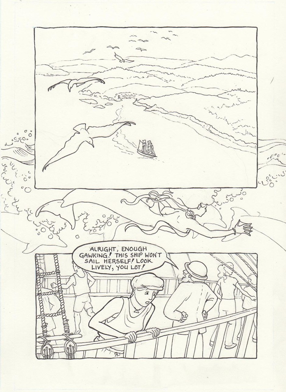
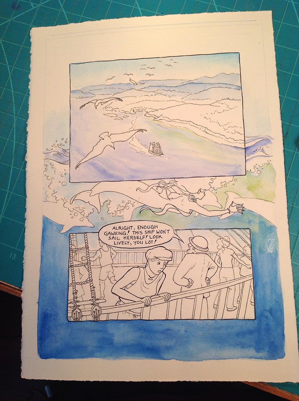
Here’s the ink stage, a proper scan. I forgot (!!!) to scan the pencil stage, which I usually do just as insurance, but it looked a lot like the inked page, just a bit smudgier. All I can say is that I was just so excited to get going! This is cropped to the outside of the bleed lines; when doing a page that will have image all the way to the edges, you need to paint beyond where you actually want the page to end so that the printer will have a little wiggle room when trimming. This is called the bleed.
Here’s my painting table. I have a slanted table for drawing, and usually keep this one flat for painting, so the watercolour doesn’t run downhill. I’ve got two paintboxes filled with custom colours, and a bunch of tube colours in case I need something really exotic (I’m a colour junkie, I know). Most of my watercolours are Daniel Smith brand. It wasn’t actually this dark; in fact there is a nice bright window just to the left, but my iPad wasn’t up to registering that!
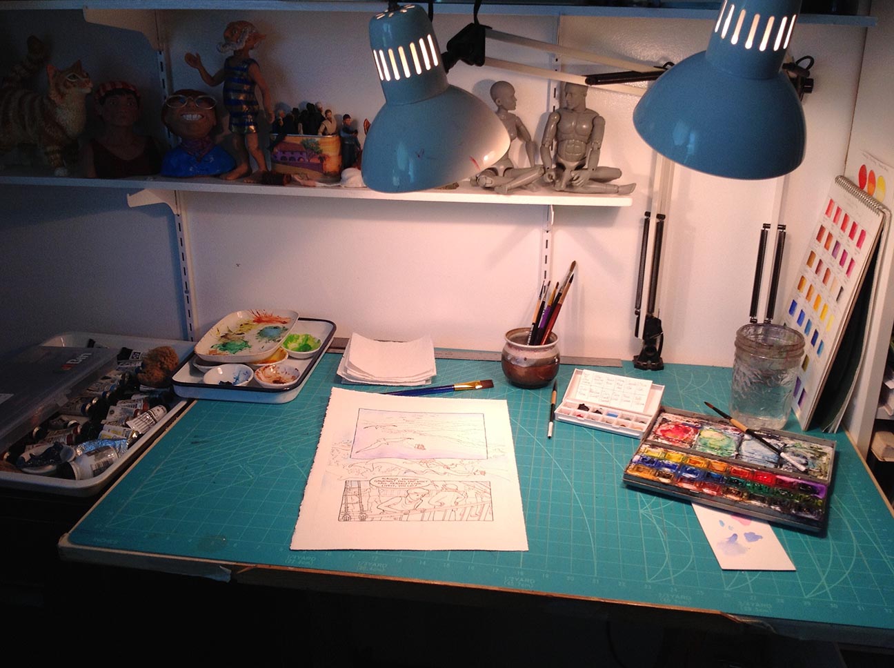
Ready to paint!
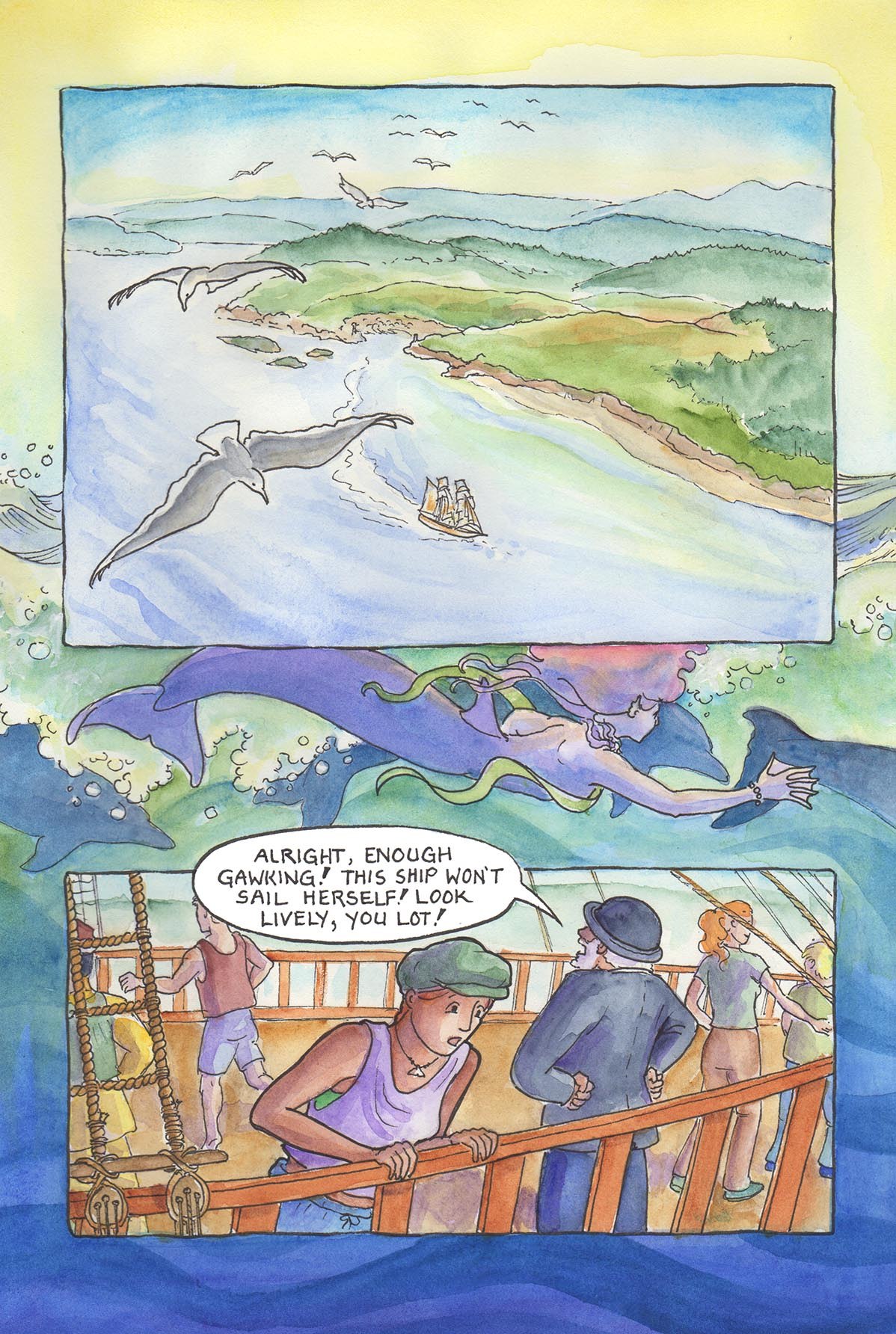
I like to start off with one predominating colour family that I know is going to be spread through out the whole page, if possible. In this case, I knew I was going to be doing a lot of blue. I started out with Manganese Blue Hue for the sky and the seafoam, and Ultramarine Blue for the sea in the top panel.
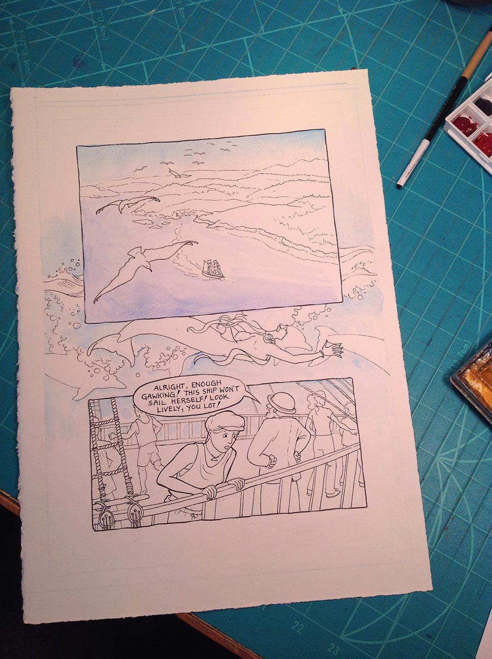
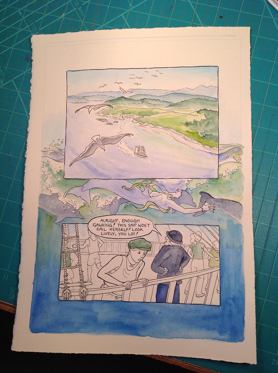
Continuing to work on the blues, I’ve added some Pthalo Blue in the bottom border and some Cerulean Blue around the mermaid. I also added some Pthalo Green and Sap Green.
Still sticking with the blues and greens: Cascade Green for the trees on the hilltops and some of the clothing; Indigo and Ultramarine Blues for Mr. Jones’s suit; and Indigo for the dolphins and Cerulean Blue for the mermaid. Oh, and a bit of Payne’s Grey for the seagulls.
Now came the fiddly part; all the little details with the warmer colours. I worked on the skin tones first, with different dilutions of Burnt Sienna; the ship’s railing is Quinacridone Burnt Orange; the ship’s deck is Raw Umber. There is also some Yellow Ochre, New Gamboge (a bright orangey yellow), Indian Red, and Burnt Umber. The violet is Ultramarine Violet.
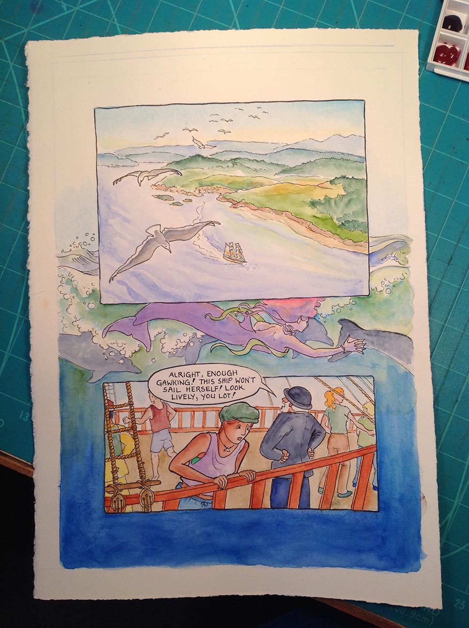
Then, lots of working back and forth, strenghthening colours and smoothing things out. I decided to make the whole margins coloured after I did the bottom (I was originally going to only have a band of bleed around the mermaid “panel”).
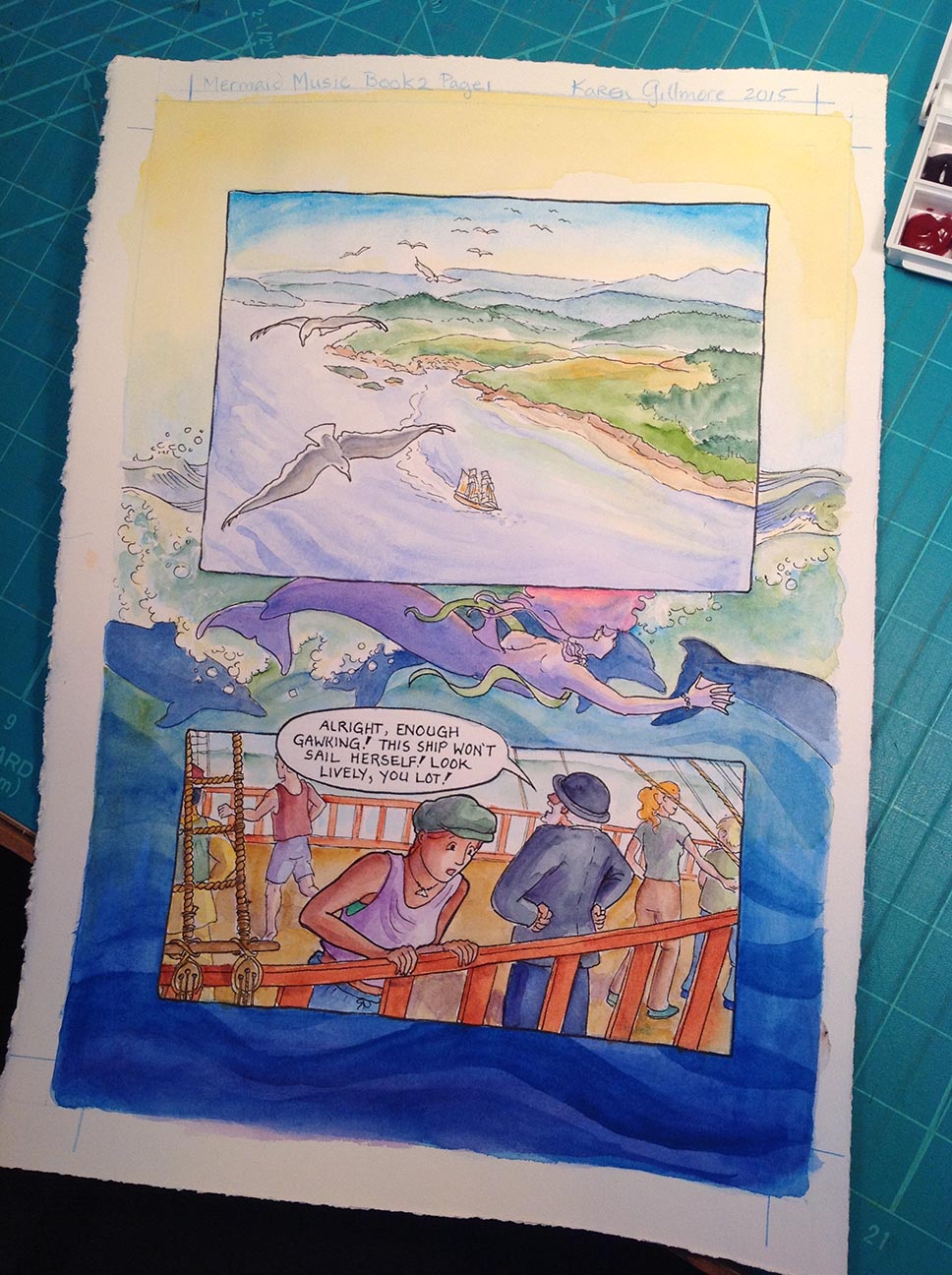
Then I did the final work of scanning, cropping the bleed, adjusting the levels to enhance the richness of the colours, and posted the comic!
So this is page 37 of the story — if you haven’t already started reading Mermaid Music, go get a nice cup of tea and sit down and read it — you can read the whole story online! If you don’t want to miss any updates, there’s a nifty subscribe button, too. Enjoy!

Thanks for posting your step by step process Karen. Your drawing and painting style fits perfecting for your graphic novel. Your post today is very instructional and inspiring.
LikeLiked by 2 people
Thank you, Sharon! I’m glad you liked it!
LikeLike
THANK YOU SO MUCH for the tutorial on this!!! I’m going to be starting on the cover for Hell’s Dodo soon, and I’m still very rusty on watercolor versus colored pencil techniques. Finally, I understand what “bleed” is. I hadn’t occurred to me to use the scanner to crop clean edges. My ancient training was to mask off the edges with tape to prevent bleed over. I guess that is still the preferred method if one wants to display and/or sell original pieces?
LikeLike
You’re welcome! There are lots of posts in the left sidebar from my watercolour classes, too, if that’s any help.
The tape method is indeed still the method of choice if you plan to display the art. Of course, this could be “cropped” with a mat if I wanted to display it (or if someone wanted to buy the page, as comic collectors do).
Usually the bleed for a printed page needs to be 1/4 inch beyond the edges of what you want the page to look like; because this is being reduced, I played it safe and left and extra half inch of bleed painting. The idea is not to put anything important in terms of details in the bleed area, and for a little ways inside the page as well (sometimes called the “safe” area)
LikeLike
I love seeing the progression of how the pictures develop, Karen! The colors come together so beautifully. The page is gorgeous.
LikeLike
Thanks, Charlotte! Glad you enjoyed it. One of these days I may do a video!
LikeLiked by 1 person
Hi Karen! I loved reading about your process and your lovely colors. I can hear your cute little voice explaining all your clever details.
LikeLike
Heehee! Guess I will have to do a video, so you can actually hear me!
LikeLike