When I’m not making comics or illustrating books or playing music, I’m often teaching art. Over the years I’ve compiled a huge amount of writing about various techniques. This page is from the handout I use in my beginner’s watercolour class. I aim to give a thorough grounding in every aspect of watercolour, from the tools and paper to the basic techniques. It’s not so much a how-to as a reference page.
Use of this page:
Artists, please feel free to print this for your personal use (you may need to copy and paste). Teachers, if you would like to use this, please let me know through the “contact” link in the upper menu and I will be happy to send you a PDF. If you share, all I ask is that I be credited, with a link to this page; I’ve done a lot of hard work in writing this document!
If you have questions, please enter them in the comments section at the bottom of this page, and I will endeavour to answer them!
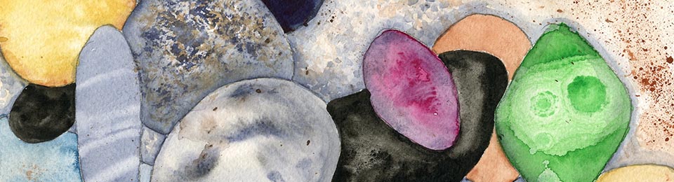
One of the exercises I give in my classes is to try out different techniques on overlapping ovals — the result is a bunch of colourful beach pebbles!
Introduction to Watercolour Techniques ©Karen Gillmore 2011-2014
Watercolour Basics:
Watercolour paints are pigments dispersed in a binder of gum arabic, along with other ingredients such as sugar or honey water for a plasticizer, glycerin to keep the paint moist, a wetting agent to obtain a uniform flow of paint, and preservatives. Yum! don’t lick your brushes!
Watercolour pigments come in various states of transparency or opaqueness, and some are staining, instantly bonding permanently with the paper fibers, while others can be lifted back off of the paper until it is white again. The more you paint, the more you will get to know the qualities and abilities of each pigment.
Washes, Brushstrokes, and Lines: making your mark
The term “wash” is often filled with mystique; much is made of doing a Proper Wash, or a Perfect Wash. Well, a wash is just a way of getting the paint to spread out in the area you wish it to be. There are flat washes, graded washes, multi-coloured blended washes — they can cover large areas of paper such as a sky or small areas such as a flower petal. The control of a wash comes with practice.
Brushstrokes and lines are as individual as you combined with your brushes and the paints you use. Two people can use the same brush and the same paint and paper and come out with completely different effects. Practice using your brushes by playing with them — see how many different kinds of marks you can make with one brush. Hold the brush in different ways. Try different sizes and types of brushes.
There are two ways of marking with a brush and watercolour on paper: wet on wet, and wet on dry:
Wet on wet means the paint is wet and the paper is wet. This gives lovely spreading effects and can be rather unpredictable, but can be controllable through practice. Still, you have to be willing to go along for the ride!
Wet on dry means the paint is wet and the paper is dry. You can do a whole painting in this manner, and get very precise results, because the paint stays where you put it.
Most paintings will be a combination of these two extremes. It is possible to complete an entire painting in one or the other of the techniques, and many people do, but the combination of the methods allows both spontaneity and precision.
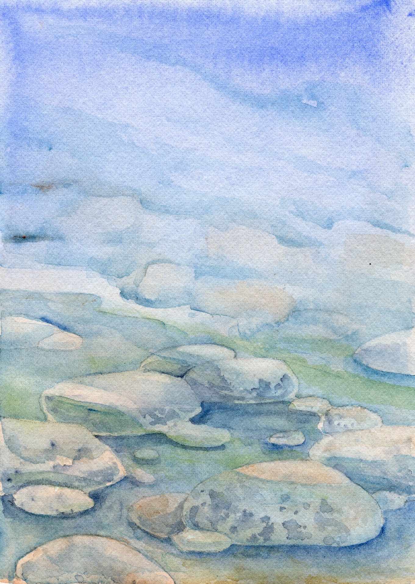
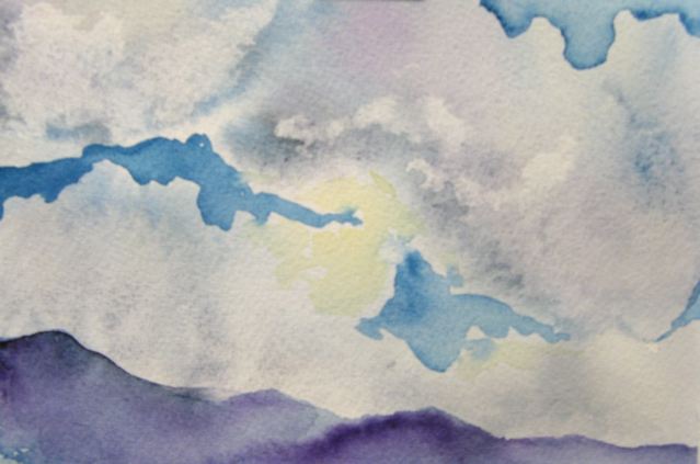
Beneath the Surface — a class exercise in transparent glazing.
About Watercolour Materials
Watercolour Paper:
Watercolour paper comes in a dizzying array of types, enough to make the uninitiated quail when presented with drawer upon drawer of different papers at the art supply store. I hope the following information will help you feel more confident in choosing the right paper for you.
I recommend trying a lot of different kinds at first; buy one sheet of this and one sheet of that, cut or tear them into smaller sizes, and play with them. You could even swap with a friend or two. Get scientific and conduct the same tests (for example, washes, lines, scrubbing-out) on each kind and keep notes. You will finally develop preferences, and then you can just stick to the ones you like. Here’s a post about one of my experiments.
Paper surface:
First of all, you will notice that watercolour paper comes in different surfaces; some manufacturers offer all, some only one or two:
• Hot Pressed has a fairly smooth, glazed surface, resulting from pressing the paper between heated
rollers. It is good for detail work and even washes, although the paint tends to slide around on the
surface, making it a little harder to control washes.
• Cold Pressed or NOT (not hot-pressed, that is) has a slightly textured surface resulting from
pressing the paper between unheated rollers. A good compromise between hot pressed and rough,
allowing good detail as well as expressive texture.
• Rough: has a prominent “tooth”, giving it a pebbly surface, resulting from minimal pressing after sheet
formation; washes collect in the indentations, making grainy textures; excellent for drybrush technique, where a brush with a relatively dry load of paint is skimmed over the tops of the surface bumps. Not a good paper choice for fine detail, but very good for painting in a loose, expressive style.
• Soft-Pressed: a few manufacturers offer this surface; it is generally described as being between hot and cold pressed, with a slight tooth. It is quite absorbent, sucking in the paint, so it is more difficult to paint dark or intense colours (it takes more paint).

Mama Eagle from Spam and the Sasquatch tells you to get the best paper for the job!
Paper Weight:
Watercolour paper comes in different thicknesses, or weights, measured either in grams per square metre (gsm) or pounds per ream, which is 500 sheets (lb). The standard weights are: 190 gsm (90 lb), 300 gsm (140 lb), 356 gsm (260 lb), and 638 gsm (300 lb). Paper weight is not an indication of the quality of the paper! Some very beautiful papers come in the entire range of weights.
Thinner paper is more likely to warp than thicker paper, and generally, paper thinner than 356 gsm needs to be stretched, or at least taped down (there are lots of videos on you-tube showing how to stretch paper — I usually just tape the edges without stretching). However, it depends on how wet you paint, so experiment with different weights to see what works for you. The thicker the paper is, the less likely it is to warp, and the more abuse and multiple washes it will take.
Machine-made vs. Hand-made:
There are three ways watercolour paper can be made:
• Machine-made: A sheet of paper produced on a rapidly moving machine called the Fourdrinier, which
forms, dries, sizes and smoothes the sheet. Uniformity of size and surface texture marks the machine-made sheet. These papers are generally the cheapest; the surface is regular and can be mechanical looking, with cut edges on all four sides of the sheet. The working qualities are often poor and uneven, resulting in frustration to the artist.
• Mould-made: A sheet of paper that simulates a handmade sheet in look, but is made by a slowly rotating machine called a cylinder-mould, resulting in deckle edges* (see below) on the two outer sides, and cut or machine-torn edges where the sheets are cut from the roll. Most medium priced papers are mould-made, of cotton fibres, and combine economy with good working qualities.
• Hand-made: A sheet of paper, made individually by hand, using a mould and deckle, resulting in deckle edges all around. These are generally pricey, but well worth treating yourself to after you gain some confidence.
*Deckle Edges: These are the feathery edges left by the mould on mould-made and hand-made paper. Some people leave them on as decorative edges, some people cut them off. It’s all personal preference. You can simulate a deckle edge by tearing (after creasing) rather than cutting when you need to make your paper a smaller size. Wetting the crease before tearing makes the tear more feathery.
Good watercolour paper is usually 100% cotton, and has sizing (starch) incorporated into the fibres to control pigment absorption. The amount of sizing can vary from one manufacturer to another. Cheap watercolour paper is machine-made from wood pulp and the sizing can be very uneven.

Part of a paper test I did when researching papers to use on Spam and the Sasquatch.
Other paper considerations:
Right side or Wrong?
Watercolour paper generally has a different texture on each side of a sheet, with one being slightly rougher than the other. You can paint on either side, there is no right or wrong side. At least one manufacturer of handmade paper even offers custom two-surfaced papers (for a fee, of course)! Use the rougher side for more expressive work, the smoother side for more detailed.
Colour:
While most watercolour paper is white, white comes in different shades! Some paper tends towards either warm (ivory or cream) or cool (blue-white); and some manufacturers even make a variety of pastel colours. They are interesting to try, but be aware that the paper colour will affect your paint colour, even the ones that are very close to white. This can be used to advantage, for instance using a cream coloured paper to give a warm unifying tone to your painting. When you are just beginning, don’t worry too much about the colour, but be aware of it as you paint so that you will learn how different paper tints affect your paints.
Sheets, pads, or blocks?
As if all those other choices weren’t enough, watercolour paper can be purchased in a variety of different forms and sizes, bound or single sheets.
• Watercolour sheets come in standard sizes, the most common being 22”x30”. Some manufacturers offer extra-large sheets or rolls, and some make smaller sheets. These can be torn (if you want to keep the “deckle look”) or cut into half sheets or quarter sheets, or any other size and format you choose. This is the most flexible, and generally the cheapest, way to buy watercolour paper; it can be especially economical if you buy it in multiple-sheet packages, usually 10 or 25 (and wait for a sale!).
• Watercolour pads can be glue-bound or spiral-bound, and are handy for carrying around for sketching. They come in many different formats and sizes, and are available bound in “landscape” or “portrait” orientations. Their main disadvantage is that they may curl if you use very wet washes, and all the paint will run around and pool in ways you didn’t intend! But you can tape the three unbound sides and get around this trait.
• Watercolour blocks: I love these! Although it is a bit more expensive this way, the paper doesn’t have to be stretched because it is bound all the way around the edges with glue, except for a small area, generally either a corner or the middle of one side, where you insert a dull blade to cut the paper loose when the painting is finished. The main disadvantage to these is that you have to finish the painting before you can cut it off, so if you work on several paintings at once, you need several pads. But I find these extremely handy for travel, so I pack several small ones.
Get the good stuff
As you can see, there is a world of paper out there to choose from, and it is one of the great pleasures of being a watercolour artist. Painting on a good quality paper is a sensual experience! In paper, as in many things in life, you get what you pay for, so don’t buy the cheapest brands; you will only find yourself frustrated in trying to achieve the effects you want from the paint.
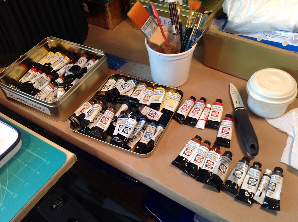
I’m a paint junkie. I love my colours. But for any one painting, i usually only use seven ten different ones. And sometimes as few as two!
Watercolour Paints
Every manufacturer has its own slightly different colour mix, due to patented processes. You will find that the better brands offer their paints in “series”, with different colours being priced according to the expense of the pigments used. The less expensive student grade paints are generally all one price, and the manufacturers have evened out the cost by replacing expensive pigments with cheaper ones which give a similar colour. Thus in a less expensive paint, you will see the word “hue” after a common pigment name such as cadmium red. This means that the paint is not cadmium red, but a blend of other less expensive pigments that approximates the colour of real cadmium red. “Hue” is also used in some cases where a “fugitive”, or easily faded, traditional colour is replaced with a more durable modern substitute. The substitution of pigments is not necessarily a bad thing, but be aware that the “hue” pigments may handle differently than their original namesake.
Cheaper colours may also have more coarsely ground pigments, less expensive binders, or less pigment in relation to the binder — all of which affect the working qualities of the paint. Don’t skimp on your paint quality — it is better to have just a few really good tubes of paint than a whole lot of second-rate ones. Winsor-Newton’s Cotman line is a good compromise between quality and economy; Da Vinci watercolours are also a less expensive good quality paint. Sometimes you will see sets of paints for significantly less than other brands; they are poor quality and will not give good results!
Tube vs Pan paints: watercolour paints come in either tubes or “pans” — these are the little blocks of colour that come in a watercolour box, similar to the ones you probably used as a kid. The quality of those childhood paints was probably pretty cheap, and resulted in wimpy colours. But there are good makes of pan paints too, that result in the same intense colours and their tube counterparts. You can even buy empty pan boxes and fill them with your favourite tube paints and let them dry for ease of travel. Whichever you use is a matter of personal preference and situation. I like using my tube paints in the studio, but I don’t like to travel with them. I have a much greater variety of tube paints than will fit in my pan set, and they are a pleasure to use when I have space and time, but the pan set allows me a familiar layout of colours so that I almost don’t even have to think which to use!

“Tropical Sun” — almost a colour wheel in itself, this painting!
Using Watercolours
Colours, Pigments, and the Colour Wheel
When we put paint on paper, we are arranging areas of different pigments which have different light- reflecting properties, enabling us to see different colours. When we mix some of those pigments together, we are changing their colour-reflecting properties so that they appear as different colours to our eyes.
The Primary Colours are red, blue, and yellow. The Secondary Colours, each of which are mixed from two of the primaries, are orange, green, and purple. Orange is mixed from red and yellow, green is mixed from yellow and blue, and purple is mixed from blue and red.
Because pigments vary in their properties, most of those we would call red, blue, or yellow are not exactly pure red, blue, or yellow. They will lean a little to the “warm” or “cool” side, which means they have elements of one of the other Primaries in them. A warm red, for instance, will lean toward the yellow side, and a cool red will lean toward the blue side.
This means that when mixing, certain Primaries will not mix with certain other Primaries to create a perfect Secondary. The reason for this is that if you mix bits of all three Primaries together, you get a neutral colour, and can even make black! So if you mix a warm red, which has elements of red and yellow, with the purest of blues, you will still get a somewhat muddy purple.
The secret to mixing secondary colours lies in combining Primaries that lean toward each other rather than away. So to make a more-or-less pure purple, use a blue that is on the warm, or red, side such as Ultramarine, and a red that is on the cool, or blue side, such as Alizarin Crimson.
Why should you mix colours when so many good colours are available straight out of the tube? There are several reasons. The first is the obvious fact that there are many more colours in the world that you are trying to paint than you can possibly carry around in a paintbox. Another reason is that the colours that you mix will be more subtle and unique than colours straight from the tube or box. And mixing colours together is one of the big thrills of painting!
The best way to find out what your particular colours will do is to make mixing charts and try them out. Try all your blues with all your yellows to see what greens you can make. Try all your reds with all your blues to see what purples result. Likewise with your yellows and reds for oranges. Then see what happens when you mix earth tones with various colours. Make colour wheels from different sets of primaries. You will be surprised at the incredible and subtle range you can get with 6 or 8 colours!
Besides its unique colour, each paint has unique handling qualities. Transparency vs. Opacity, Staining vs. Non-Staining, granulating (sedimenting) or smooth — you can read up on these qualities, or discover them as you explore your paintbox. Manufacturers’ charts (on-line or posted in your art supply store) are very handy for reference until you get the hang of your paints’ individual personalities.

“Haunted River” — painted over a saran-wrap texture in multiple glazes; an example of mixing paint on the paper. There’s a wee bit of coloured pencil on this, bringing out the highlights.
Two ways of mixing colours: on the palette; on the paper
On the palette: Colours mixed on the palette can be blended to perfection ahead of time. You can test the colour on a scrap of paper and make sure it is exactly what you want. You can mix large amounts to guarantee an evenly coloured wash over a large expanse.
On the Paper: This can be done in two ways: wet on wet, or as successive layers, called glazing. In the wet on wet method, you allow the colours to blend into each other either by placing two wet washes side by side, or by dropping colour into a still wet wash of another colour. In the glazing method, you wait until the first layer has completely dried, then paint another colour over it. The two colours will optically blend, as well as some actual mixing due to the re-wetting of the first layer.
Both palette and paper mixing have their advantages and disadvantages. Palette mixing results in even, predictable washes of precise colours, but can look somewhat dull due to that very evenness. Paper mixing results in lively combinations with sparkle and depth, but can be unpredictable (especially when you’re starting out) — but that’s part of the fun!
“The Sky’s the Limit” — a tiny painting, 4×6 inches, in which I demonstrated lifting wet paint to reveal the light.
Concerning White:
In watercolours, white is what you start from, as that is the colour of your paper. Since we generally work from light to dark in watercolour, and white is the lightest “colour”, you will need to think about the important issue of White, whether to preserve it, lift. scrub or blot back to it, or add it later.
Preserving the White:
to preserve the white of the paper, the most obvious way is to just not paint it! Many artists use only this technique, and the results can be quite elegant. It takes planning, patience, and a steady hand, but you can paint around even quite intricate white areas successfully. This is usually my chosen method, partly because it is often more trouble to mask it. However, there are times when masking can be very valuable, such as when you want an even coloured wash over a large area between the light details.
Resist and masking techniques:
masking fluid
This stuff is a cousin of rubber cement. It resists the paint and protects the paper underneath from colour. It comes in white and coloured forms; the coloured ones are easier to see but make it harder to visualize what you are painting. There are both brush-on varieties, and my favorite, one that comes with an applicator squeeze-tip for greater control. If you use the brush-on kind, don’t use your good brushes. Really! If you rub soap or detergent on your brush first, it will be easier to clean, but this stuff really limits a brush’s life. Use cheap or old brushes, or a rubber nib tool. Be sure to get the masking fluid off of your painting promptly (don’t leave it for days), or it can be difficult to remove. You can paint over areas that you have previously masked and removed, making intricate layering of colours possible. The big drawback to this stuff is that it is thick and hard to handle, making very precise masking difficult.
crayons, oil pastels, and wax candles
These can be used in white or colourless forms to reserve the white of the paper. They cannot be removed, however, like masking fluid, so be sure you want that area to be white! Just draw on the paper with them — you may have to tilt your head sideways to be able to see them as you draw. A variation on this is to use coloured crayons or oil pastels to create coloured lines. One thing that this technique is very good for is preserving a textural white; that is, you use the waxy medium to draw lightly over the bumps of the paper, and the paint will be resisted on the bumps but stick in the valleys.
masking tape and sticky shelf paper
these can be used to mask off larger areas very precisely. They are a bit fiddly to cut to shape (unless you are going for the randomly-torn look), but worth the effort for clean-cut edges. Lightly burnish the edges so that paint doesn’t leak underneath, but not too hard or the tape will remove paper when you pull it up. Remove carefully, at an angle. This is also a good way to preserve straight edges for later painting, such as horizon lines, or buildings.
Lifting effects:
brushes, paper towels, sponges, and rags can be used to blot away colour, either used dry right away from a wet wash, or used wet for a wash that has dried. These can create clouds and shading effects. Brushes can be used to create white lines instead of painted lines by using clear water and then blotting a bit if necessary. Keep in mind that some paints stain the paper more than others, and you might not be able to get back to a clear white; if it is important, test the colour and its lifting properties on scrap paper first.

“Night Lights” — the background nebula-like blooms of sky colour are salt; the individual stars are dots of white ink.
Adding White:
Sometimes none of the above can give you fine enough detail, or you decide you want some white in an area after you have painted. In this case, the following can be useful:
• China white or white gouache: these are basically the same thing — a watercolour binder with a white opaque pigment. You can use these straight or mix them with your colours to make opaque tints. They will tend to absorb colour from beneath (which can in itself be a nice effect), so if you want a very white area, apply the white thickly; you may have to apply it twice. It is a much softer-edged white than the ink, since it will tend to blend a bit with the surrounding colour. You can blot this stuff up just like regular watercolour, although it may leave a residue of white particles.
• White ink: can be applied with brush or pen. Different brands have differing opacities, and may need to be gone over a time or two. Usually this is a permanent ink, so be sure to put it where you want it. Excellent for very precise white lines. I like the acrylic white ink for this.
• White Acrylic: very opaque, and permanent. Can be overtinted, but watercolour will tend to slide off the surface. The sliding effect makes it a semi-resist for subsequent overpainting.
You can also spatter any of these white mediums, using an old toothbrush, for a speckled effect, such as snowflakes, textures on rocks, or sparkles on water. Similarly, you can spatter masking fluid for a speckled mask effect.

“Edge of the Woods” — I started with very light, wet-in-wet washes to build up the misty background and lighter tones of the foreground; the dark trees went in last.
Making a watercolour painting
There are many ways of composing a painting, as many ways as there are painters. Making a painting means making constant decisions, about subject, mood, colour, composition, and even when to call it finished! That’s all part of the fun – but the there are a few steps that you can follow that will break down a seemingly complicated task into manageable bits.
• Choose your subject. Choose something which moves you personally.
• Get acquainted with your subject. Make a couple of small sketches in your sketchbook .
• Sketch your subject on the watercolour paper. Use your pencil lightly and sparingly.
• Decide which areas you want to leave white. Paint around them with your first wash, or mask.
• Paint from light to dark. light washes first, then next darkest, on to deep shadows and linear details. • Listen to your painting. Step back and look at it; set it aside for a while if you feel stuck
• Know when you are done. It is very easy to overwork a watercolour painting!
Contrast
Contrast is essential to any painting. It enables you to tell the difference between different objects or parts of objects without using an actual line. gives the illusion of three dimensions, and helps the eye travel around a painting.
Some examples of Contrast:
• value: lights, middle tones, and darks — include a range of values in your painting for maximum impact!
• texture: watercolour special effects such as salt or backwashes; smooth, spiky, furry, speckled (different sizes of speckles), busy, calm, lines (different directions of lines), dots… • colour: warm vs. cool, complimentary colours (opposites on colour wheel: blue/orange, red/ green, yellow/purple)
For more on how to use watercolours, see the Watercolour Wizardry post.

Hi Karen – what a fabulous tutorial. You sample art and explanations make it so easy to get started with water color. Thanks so much for sharing your knowledge. 🎨
LikeLike
Thank you, Sharon! This is all stuff I wish I had known when I was starting out — I do hope it helps others!
LikeLiked by 1 person
Explanations of color are spot on! Several “how to” books complicate what you established easily!
LikeLike
Thanks, Meg! This post is based on my beginning watercolour class, and I’ve distilled the colour issue down to basics over many lessons. Colour theory can be pretty complicated (and fascinating!), but for working with paints, an awareness of these few basic principles and a willingness to experiment goes a long way.
LikeLike
Thank you for sharingKaren.x Jan
LikeLike
You are welcome!
LikeLike