Hi everyone! This is week three of my Friday posts for “Comics for the Curious Beginner”, a six-week class I’m teaching at Monterey Centre in Oak Bay. This post expands on and illustrates yesterday’s class; I hope it will be interesting to non-class readers as well. I’m using my own comics here for examples, not because I’m vain, but because I don’t have to worry about copyright issues that way. I have put in a few links to examples of other comics.
Yesterday we talked about various construction aspects of comics. There are many, many different ways to lay out a comic, so I’m sticking to the basics here, outlining a number of possibilities which can be fit together in different ways. I think of this as the hardware with which a comics creator can build a home for a story.
Some essential terms:
The Panel or frame:
The box that confines and defines one moment of action. While usually square or rectangular, panels can be of any shape, geometric or freeform. Panel borders can be of any style: ruled, freehand, thick, thin, shaky. sketchy. They can even be just the edge of the colour, without any drawn line. Wavy or curvy lines for borders are often used for flashbacks or dreams.
How many panels should you use? How should they be arranged? Many comics creators use simple, regular grids to great effect:

1. The basic six-panel layout allows generous, square spaces for the art.
2. A nine-panel grid’s smaller, portrait-style panels allow more action per page.
3. This sixteen-panel grid is great if you want lots of action, few words, and very simple art.
4. This is another way to fit six panels on a page. Think tall, thin compositions!
Left to right, and top to bottom, is our usual reading direction in the Western World. Manga comics from Japan are read from right to left, and top to bottom. Their front cover is where our back cover would be!
Pages are not always arranged vertically. Newspaper comic strips and comics designed for the web take advantage of a horizontal format. Other factors can affect our reading as well:

The left image is the same six-panel grid as above (enlarged) and flipped 90 degrees. Notice that there seems to be some resistance to the smooth flow of reading left to right, The eye is confused between wanting to go to the next panel to the right, or to the next panel below.
In the subtly adjusted six-panel grid on the right, more space has been added between the top and bottom tiers (Tier: A horizontal row of panels), and space has been taken away between horizontally adjacent panels, giving the eye the clues it needs to find out what the narrative is doing next.
So: the spaces in between panels affect our perception of the flow of the panels. In comics, space can equal time. And that brings us to…
The Gutter:
The gutter is the space between panels. Gutters allow the panels to be seen as distinct entities. They can also be used to control pacing: narrow gutters (which means the panels are spaced closely) imply close-together action, events happening rapidly. Wider gutters imply a break in the action, or more time elapsed.

The scene at the top of this page is a vignette. There are gutters between the other panels. The middle tier is a bleed, designed to go to the edges of the page.
Some comics do not have gutters, such as a comic composed partly or entirely of vignettes, or scenes without panel borders.
Some comics use only lines between the panels, not gutters; if using this kind of layout, make sure that the composition inside each panel is distinctly set off from the others, so you don’t end up confusing the reader as to where one scene ends and another begins. Sometimes the gutters are coloured to imply a mood, or just to set off the art to advantage. Occasionally you may see a background image used to fill the gutters. This can look really cool, but needs careful composition to make sure it doesn’t confuse the flow!

One of the few times I’ve done a gutterless section in a story is the bottom tier of this one. It compresses the events into a short space. In Quadra Cats (as well as Spam and the Sasquatch), I often let the balloons hang out into the gutters or even overlap panels, resulting in less regular shaped gutters, which is also accentuated by the fact that I like to draw my panel borders by hand.
A large, full-page illustration that opens or introduces the story, or emphasizes some important scene, such as a climax or change of scenes. It can be an establishing shot at the beginning, or a particularly dramatic moment in the story. These scenes often have more attention to detail lavished upon them, and can convey a lot of information. They also help to set a mood. They are often, though not always, a bleed (when the image goes all the way to the edge of the page). Here’s my full-bleed splash page from the opening of Spam and the Sasquatch; it serves as a prologue to the story, and is in a more painterly style than the rest of the book.

This gives background for the rest of the story, though events don’t follow directly from this scene.
Spread: An illustration taking up two pages (or more, sometimes using foldout pages). These are used when the action or setting require more space to convey details or a spacious sense of location. Like splash pages, they are often full-bleed, though not necessarily. Here’s the inked spread from my upcoming webcomic, which will be revealed in full, living watercolour this coming Monday, February 2nd.
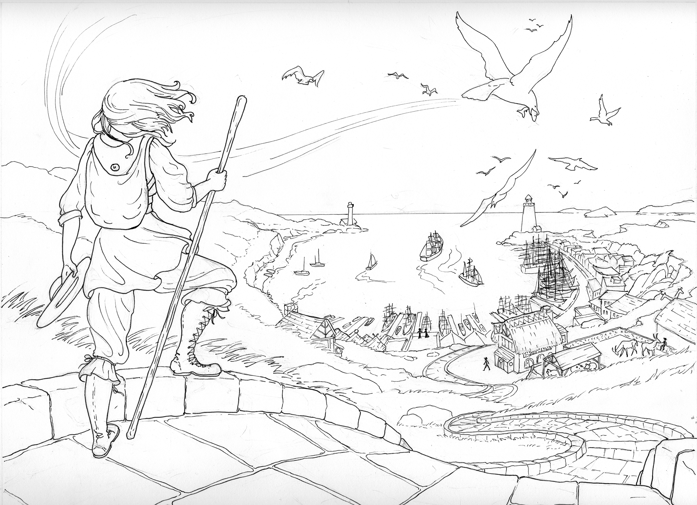
The end of one journey and the beginning of another.
Balloons:
Balloons are the shapes that contain the dialogue portion of your story. They are usually oval, or a combination of ovals lumped together, but can be any shape. They can have border lines, or not, perhaps just being defined by a balloon shaped field of colour.

Balloons, like panels, tend to be read from left to right and top to bottom. A good thing to be aware of when you are setting up the position of your characters!
Balloons showing thought (sometimes called thought bubbles) are often shaped like poofy clouds or, yes, a group of bubbles, and have a line of dots leading to the speaker. Whispers are sometimes shown as balloons with dotted lines.

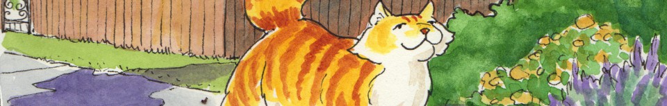
Spam is thinking hard here to outwit Mama Eagle!
Sometimes characters are given their own distinctive balloon shapes with appropriate lettering (Walt Kelly’s “Pogo” had a lot of this). In David Mazzucchelli’s graphic novel Asterios Polyp, the balloons are shape-keyed to the characters. A balloon can also be shaped to show emotion, such as a jagged-edged one to show anger, a dripping one to show sarcasm, or an icicle-bottomed one to show scorn. Balloons are usually white, but can be any colour, and are sometimes colour-keyed to their characters.
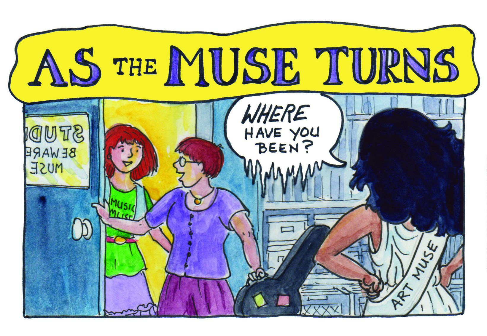
Iris gives me the cold shoulder via an icy word balloon. From my Muse comic.
Balloons have a tail or pointer that leads the reader’s eye to the character who is speaking in that balloon. When a character has more than one speech bubble in a panel, sometimes these are overlapped or connected by little tubes (hoses? snakes?) instead of tails. When two characters are speaking in a panel, make sure that it is obvious who is saying what. If possible, point the tails toward the mouth of the speaker (not, for instance, their belly button!).
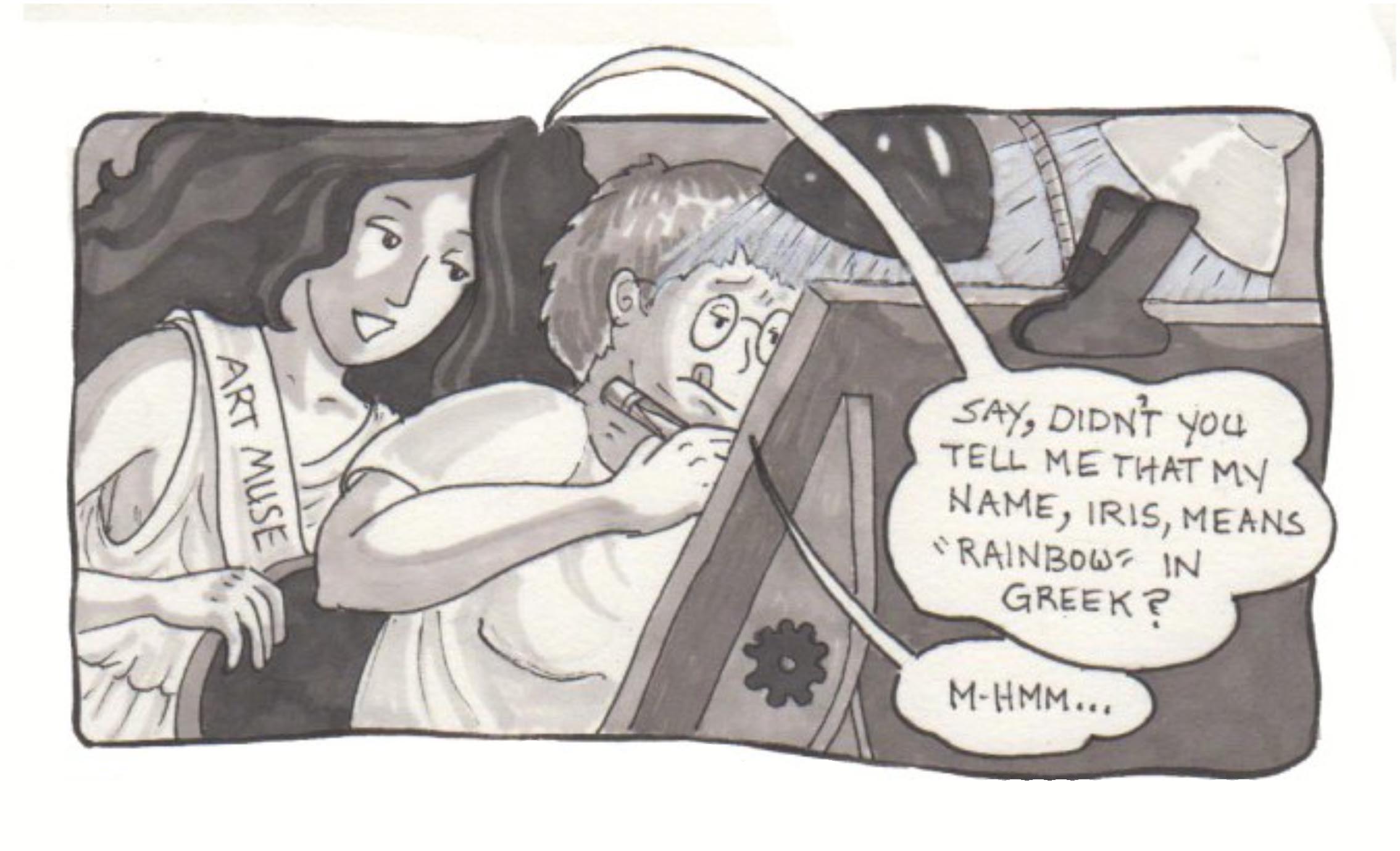
This was a bit of a stretch! I wasn’t planning ahead enough as far as the text went, and ended up with the only empty space big enough for the balloons in the lower right — but Iris was in the upper left, and the only way to get her balloon tail to point at her was to make quite a long swoopy one. It works in this comic, because it’s quite free-form, but really not the best thing I could have done.

Balloons can overlap — here, the fact that the balloon of the “me” character is overlapping Iris’s shows that I’ve interrupted her, while she continues to drone on about deadlines.
Placement of balloons is important: you don’t want to cover up any essential art (though sometimes you may have to overlap some art so that you get all the words in). Lettering should be big enough to be readable (and legibly written). Sometimes you will have to edit your dialogue to keep it in the space needed (think Hemingway).

It was really tough to fit all the dialogue into this scene. I did some editing, but still ended up covering up more of the artwork than I would have liked, even though I had planned space for it. I could have made the letters smaller, but then they would have been less readable. I’m learning to plan more space for wordy conversations! Notice in panel 3, the second speaker (the pink-haired lady) is not even visible, so I just pointed the tail of her balloon in her general direction.
Caption, Narrative, and Voice-over Boxes:
These contain writing that is not dialogue. They are usually rectangular, but can be any shape, as long as they are not confused with balloons. They can contain explanatory narrative, or act as a kind of voice-over. They can be placed adjacent to the top or bottom of a panel, or floating inside it. Caption boxes, common in one-panel cartoons, are usually at the bottom of a panel, outside of it; Narrative and voice-over boxes are often, but not always, at the top.
These boxes are usually coloured, particularly if floating in the panel, to distinguish them from balloons. Like balloons, they can be shape-or-colour-keyed to a character, or a mood, or place. In Eoin Colfer’s Artemis Fowl series, the narrative boxes are colour keyed to the character, as there are two different points-of-view going on throughout the story. Sometimes boxes are used as bridges between panels, overlapping both and leading the reader’s eye to the next place the artist wants them to go.

In this panel-less page from Tam Lin, from my Telling Tales collection, the caption boxes are arranged to lead the eye, along with the swirling picture, in a kind of backwards S pattern, with the last one leading the reader to turn the page. I had fun making fancy boxes in indesign here. The wind is represented by speed lines.
Fun Stuff:
Emanata
These are icons or text elements that indicate what a character is thinking. These are culturally linked; those in western-world comics being different from, for instance, Japanese manga. Here are some common ones:
Light-bulb — an idea
ZZZZ — sleep (or a picture of a log being sawed!)
Question mark — puzzlement
Exclamation point — Surprise
Black scribble — frustration or annoyance
Sweat droplets flying from head — effort, worry
@#$%:&*@$!! — anger, cussing
Hearts: love
Radiating lines: alarm, anger, surprise, serenity, depending upon context (usually facial expression)
Emanata have even been categorized and named by a cartoonist named Mort Walker. Check out this article for a bit of vocabulary expansion, both visual and linguistic.
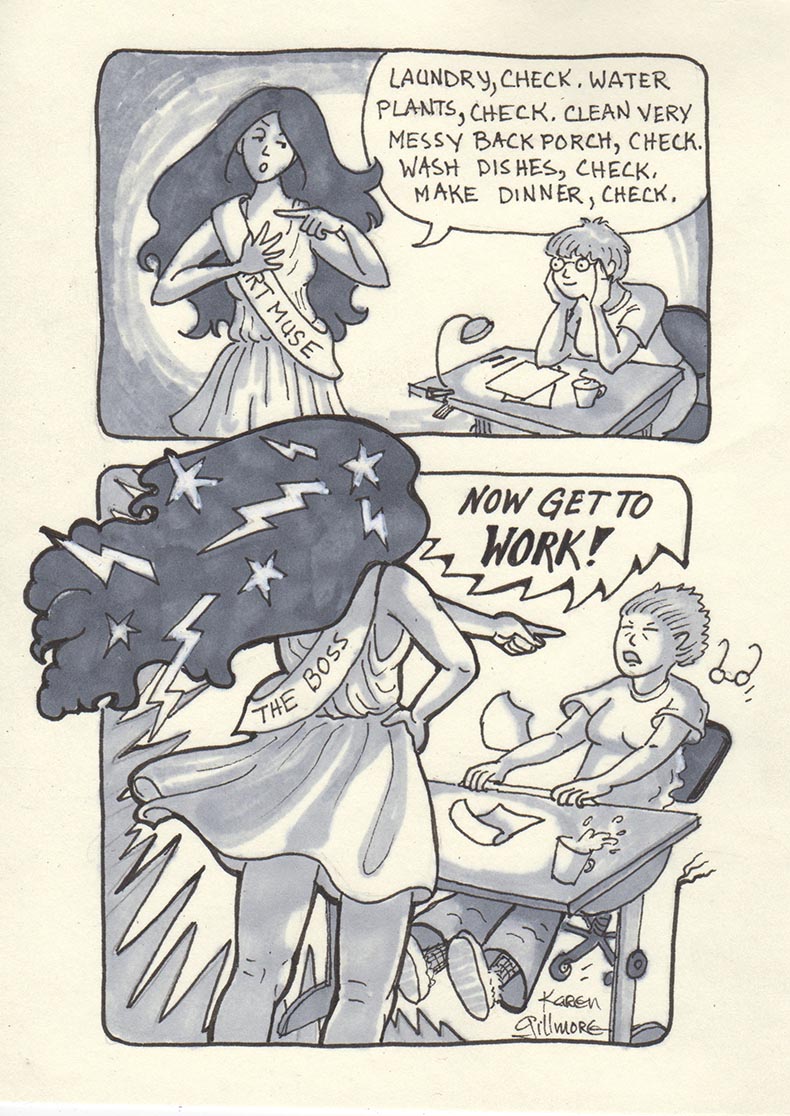
Stars and lightning in Iris’s hair and jagged radiating lines show her taking on goddess-like power! Somebody has to be in charge around here…
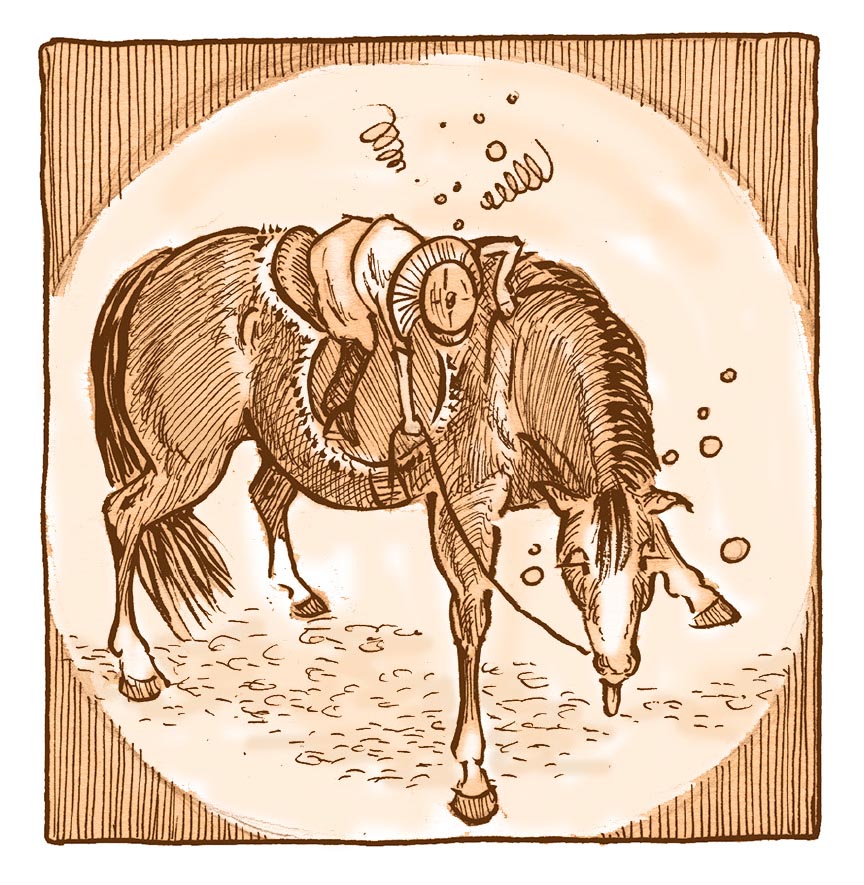
The young heroine of Horse Sense, another story from Telling Tales, expresses her frustration and wooziness with emanata. The horse is just woozy.
Sound Effects (or onomatopoeia):
These are letters showing sounds outside of dialogue. They are often very expressive and brightly coloured. They can be shaped to indicate the qualities of the sound. For instance, if you wanted to show “Whizz” receding into the distance, you would draw the beginning of the word bigger and trailing off into lots of smaller Zs.
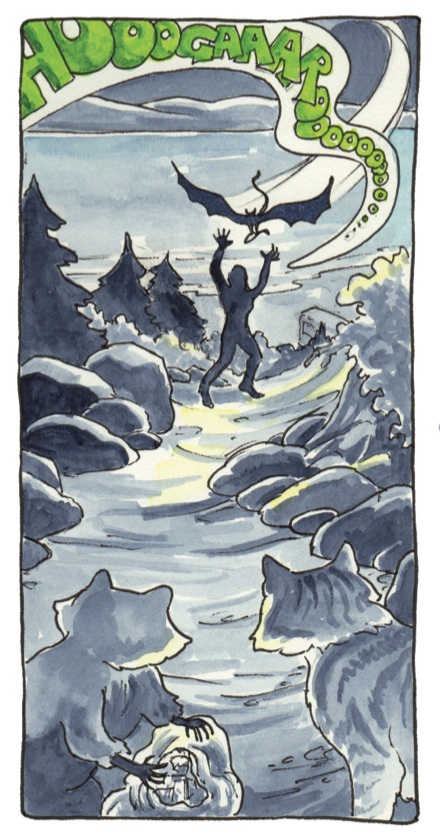
The Sasquatch’s cry is colour-keyed to her smell (see below). Rather than put it in a dialogue balloon, I’ve treated it as somewhere between dialogue and a sound effect, with free-form white space surrounding it, tapering to a tail pointing at her mouth.
Sound effects can be really fun to play with, but make sure that the size of the sound effect is in proportion to the sound within the panel. For instance, if someone dropped a dime, you would draw the “clink” fairly small; if they dropped an anvil, the “clang” could take over a large part of the panel, and have its own jagged emanata around it. Upper and lower case also indicate loudness of sound. Sound effects can also be indicated by symbols (a picture of cymbals, haha) such as musical notes.

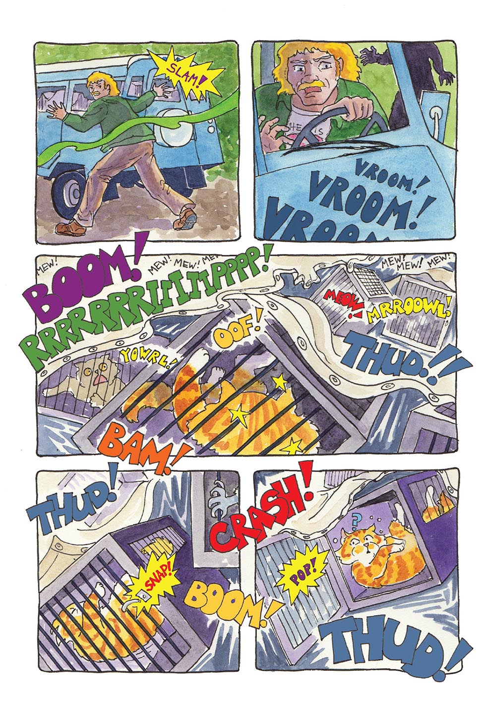
The sound effects here are two kinds; a noise (thud), and utterances (woof, yeowl, growl). Notice Spam’s switching tail here, too, created by overlapping multiple images.
In this scene, i tried to convey the chaos and noise by varying sizes and colours of noises, oriented in different directions. The tiny “mew mew” of the kittens (middle tier panel) shows the relative loudness.
Other Senses: Smell, taste, touch, sixth sense…
Other senses can be represented visually as well. Smell can be represented as a drifting fog. Taste is a little harder and I can’t think of any standard way that it is represented — but a look of bliss (or disgust) on the face of the taster tells us what is going on! Touch is shown in the reactions of people, but sometimes has its own emanata: Sleeping Beauty pricking her finger could be shown with radiating lines from the sharp spindle; pain is often shown with stars; burning is represented with flames, even if nothing is literally on fire. Telepathy or other manifestations of ESP are often represented as emanating rays from the person wielding the sixth sense.

The smell of the Sasquatch (which kind of has a life of its own) is colour keyed to her cry; the only time this colour is used in the book is to indicate the Sasquatch’s sound and smell.
Speed or motion lines
Speed lines are graceful, whooshy lines like a trail behind a fast moving object, sometimes overlapping it. Motion lines are lines that show where an object has been by echoing its shape, as if you see several frames of an animation. These are useful to show a change of direction, or rapidly changing motion such as a person doing a double-take. Sometimes speed and motion lines are combined. Speed can also be shown by poofs of dust or smoke behind a speeding object or person.

Here’s the page that preceded the dizzy horse and rider above! Speed lines and multiple partial views show just why Casey and Ben get so dizzy. In the panel at the top right, the panel border itself gives an indication of impending dizziness as Casey discovers how tall horses are.

This panel contains a lot of different ideas discussed here: speed lines and motion lines from Sven’s arm as he tosses poor Spam; a bleed on the lower half of the page; inset panels; a vignette effect on the main scene as well as the transition from the top panel; emanata; imagery being used as a backdrop for panels; sound effects, and a “dust” cloud.
Exercise 1:
Draw a short comic using a selection of the “fun stuff” above, and different kinds of panels and balloons.
Exercise 2:
Draw a “silent” comic with stick figures, and using different body language, have them act out their emotions. Then hand the comic to someone else and see if they understand what is going on. This is an exercise in both gesture and communicating clearly.
Exercise 3:
Take a short script that will fit on one page, and do thumbnail layouts for it in as many different configurations as you can think of. You don’t have to draw all the action, just note what goes in each panel from your script. Notice how it affects the flow of the action and accentuates different aspects of the story when you use different shapes and sizes of panels.
Exercise 4:
Go poke around in these two websites: For a lot of good exercises in comic drawing, go to this link, 99 Ways to Tell a Story: Exercises in Style by Matt Madden — click where is says “click here” and you can see a number of the exercises. The creator is one of the authors of a book I highly recommend, Drawing Words and Writing Pictures (the sequel to which, Mastering Comics, is on my wish list!). The website for the book is a tremendous resource for all things related to making comics – and there are exercises there, too!
Links
Here are some links with definitions and glossaries of comic book terms. Not all of them totally agree (this is the internet, after all!) but taken together, they can give you a really good idea of the nuts-n-bolts of comics.
More links:
About.com has a “comic book culture” section, and a glossary with 75 articles!
Wikipedia has an article on terminology that is succinct and clear.
Let’s not forget the art of constructing your story. Here’s Kurt Vonnegut in a hilarious but very useful video.
Here’s a slideshow outlining how the Pixar artists tell a great story.
This article has some good insights on how our eye flows through a comic, using Winsor McKay’s Little Nemo as an example. There are also some good links in the article to follow.
The Comic Strip Library is a great way to browse different styles of public domain comics without having to buy a bunch of books!

Thank you Karen – you are so generous with your information. What I love about your drawings is always the interesting point of view. You know how to pull the reader into your story. Beautiful and exciting art!
LikeLiked by 1 person
Thanks, Sharon! It makes me happy to share — I also find people appreciate the art more if they know what goes into it, something I learned long ago in my hippie-craftsperson days when selling bead jewelry (hm, ought to write a post about that!). Although I’ve always tried for interesting compositions, I learned a lot about using different points of view when I was taking the Comics and Graphic Novels Program at Camosun College, and later a mentorship with the program leaders, Ken and Joan Steacy. Ken in particular pushed me constantly to make my panels more dynamic, and I’m grateful for it!
Having the toolkit of cartooning really has added to what I can do, as opposed to illustrating. I feel I don’t have to take things so seriously, and can really play with the compositions more — I kind of have an inner slapstick comedian that comes out in the comics!
LikeLiked by 1 person