Another post for comics class (see tab at right for the series)! I’ve linked a couple of products to one of our local art supply stores, Opus, because they have a good online catalogue with pictures. Any art supply store will have most of these kinds of paper.

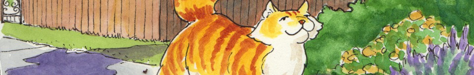
Some in-progress shots from Spam and the Sasquatch.
Once you’ve decided what kind of drawing implement you are planning to use for your finished comic, it’s time to choose your paper. This is dictated by what kind of surface you want to work on: a very smooth surface for intricate pen or very sharp brush work, or a surface that will allow watercolour to slide nicely for a bit on top of the surface before the paper fibres suck it all in, or something with a bit of tooth or texture to give a rough look or hold coloured pencils.
- Bristol board is the perennial favourite of comics artists for doing finished work. Its smoothness and durability allow smooth ink coverage, and if you make a mistake, it can often be corrected with a bit of fine-grit sandpaper (though the surface is affected for further applications). It comes in two surfaces, vellum, which is fairly smooth but with a bit of tooth, and smooth or plate, which is very smooth and good for fine pen and ink work, though not as good as the vellum for watercolour. Strathmore and Canson are both good brands. I noticed that the Canson recycled pads have a choice of surfaces on each sheet, one smooth and one textured.

As the Muse Turns — pen and ink with watercolour on Strathmore smooth bristol. I was experimenting with this smoother paper, since I have a pad of it lying around; it’s beautiful to draw on but the watercolour handles rather strangely. Not bad if you’re just doing small areas, but the larger ones are hard to get a smooth wash on. Very sturdy for multiple layers of paint, more than the vellum surface.
I’m currently working on vellum bristol on Mermaid Music, and feeling a bit sorry that I chose it. The watercolour handling qualities are not nearly as good as the paper I chose for Spam and the Sasquatch. If only I had known then — I pencilled 36 pages on the bristol and wish I were using the watermedia paper I talk about below. I’ll be able to switch after this chapter.

This is the vellum bristol. I found that the paper got saturated quickly when trying to do dark tones, and it looked smeary. So I added some coloured pencil to smooth it out.
- If you are only going to work in pen and ink, and a lighter paper is acceptable, Pentalic’s “Paper for Pens” is a joy to work on. it’s lovely to colour with markers, too, though it doesn’t have enough tooth for coloured pencils, and is too thin for watermedia. I’m not sure where to get this locally, but I know you can order it online.
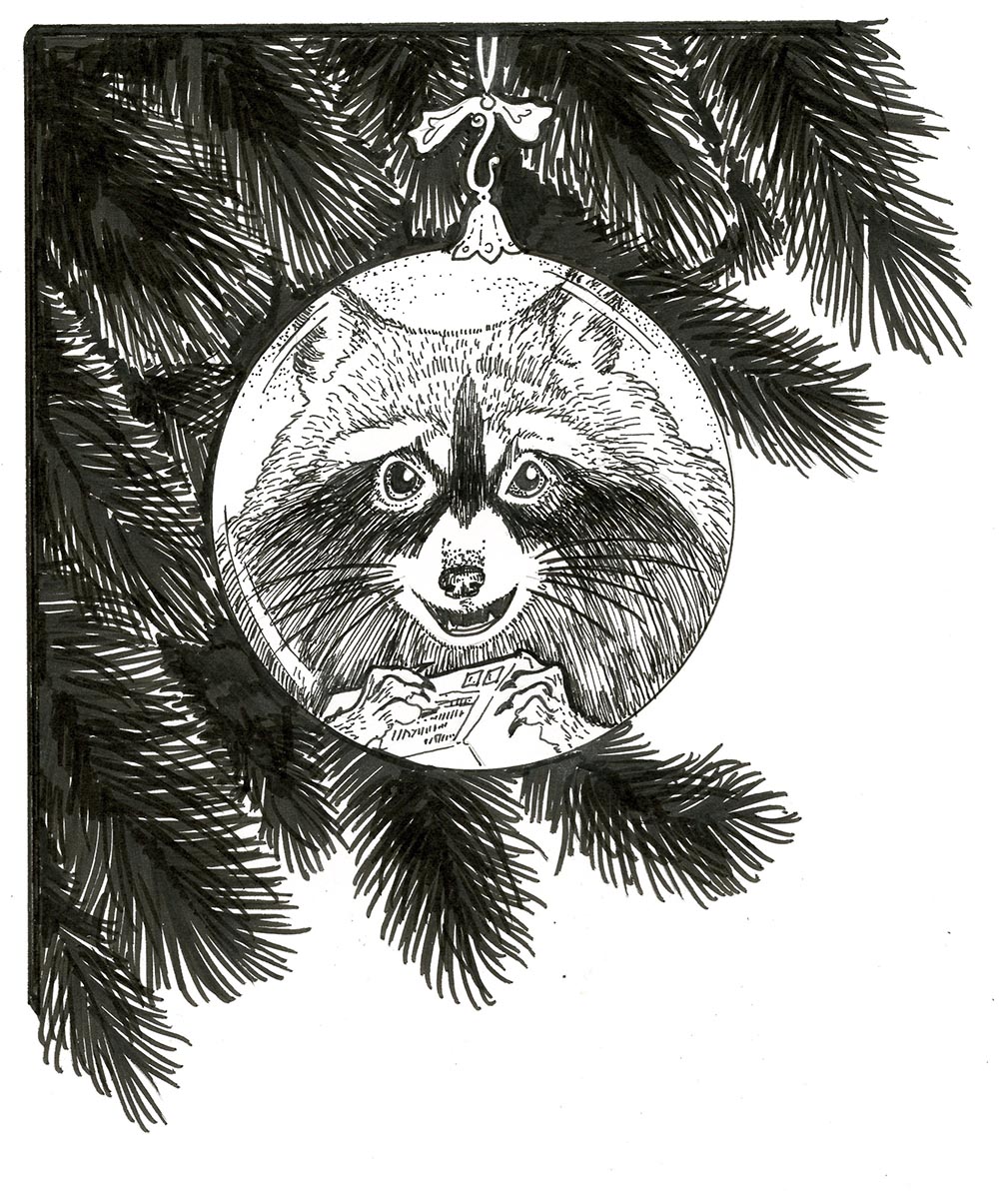
I used Paper for Pens with Pigma Micron pens and brush Marker for Renfrew the Raccoon’s illustration from Father Christmas.
- If you plan to use watercolour, you can use the bristol paper, or try out some of the smoother watercolour papers. I did a series of tests of my own to find the right balance between smooth-enough-to-ink and good-for-watercolour. I found a happy medium in Opus’s Watermedia paper.
When I decided to do a graphic novel, I knew I was going to be working for a long time on the same paper (if I switched types in mid-stream the look of the work would change). So I did a series of experiments that helped me choose what I would use. I ultimately ended up with Opus Watermedia paper, which performed well throughout the project for the watercolour, and was smooth enough that I didn’t get wobbly ink lines as regular watercolour paper might have done.

Part of the paper test I did when researching papers to use on Spam and the Sasquatch. This is the one I chose.
- Comic Art Boards — this is vellum bristol with pale blue lines pre-ruled for borders, bleeds, and with markings for standard panel measurements. Convenient and decent paper to work on, especially if you are processing digitally and can easily get rid of the blue lines. The ones available locally are by Fanboy, and come in standard and manga sizes.
However! While there is a “standard size” for comic books (like the kind you see in the racks at the comic store), people these days are making books in all kinds of different sizes. If you plan to print yours, just make sure they’re all the same size, and talk to a printer beforehand about safe margins and bleeds and such. Here’s an article by someone who is exasperated by the lack of standardization in comic art boards; I say don’t worry about it overly much! And here’s some diagrams and an article from Blambot, a great source of comics fonts, explaining a bit more about layout of a comic page, explaining some of those arcane terms!
