I just finished the 64 pages of thumbnails for one of the graphic novels I’m working on, and am feeling like celebrating! Whoo-hoo! Since I’m watching my calories, I won’t get out the chocolate, but I’ll have some fun by telling you a bit about the process of how I make a comic — and give myself a bit of encouragement by remembering that it’s all step by step, and with persistence I’ll eventually have the whole book completed. It still looks a little daunting at this point, but hey, I’ve reached the first milestone on the journey!
If you’re unfamiliar with the term “thumbnail”, for art purposes it’s not that hard bit on the end of your thumb that you use to open envelopes. Properly, it’s “thumbnail drawings”, which are a bit larger than your actual thumbnail, but not much. Generally, they’re tiny little sketches, maybe 2×3 inches, that artists use to map out the general composition of a larger work, sometimes just concentrating on values, sometimes with colour. At any rate, they should be quickly drawn and not fussed over.
For comics artists, they’re both a means to map out the story and work out the composition at the same time. The storytelling is refined by the way the panels are laid out and how much information goes into each one. The pacing is determined during thumbnail layout. It’s a lot like storyboards used for movies, except that you get to play with different shapes and sizes of panels. The drawings within each panel have to be well composed in themselves, but also have to work with the panels around them. Each panel has to convey its bit of the story clearly, and ideally look good in the context of the whole page or 2-page spread.
I like to work from a written script that I have written first, and divided up loosely into pages, so that I already have some of the pacing worked out. Lots of artists just start with the thumbnails and see where the story takes them, and tighten things up or space them out in more drawings; but I find it easier and faster to write than to draw a story.
Here’s a sequence of sketches I did for a short history story I did called “Cougar Annie”. I’m only going to show the first page for this post, but I’ll put up the whole story soon.

Thumbnail drawings for “Cougar Annie” comic, pages 1-3
This is an 8.5×11 inch sheet of paper, to give you an idea of the scale. It’s actually a template you can buy in pads or loose sheets, with the divisions mapped out and lined areas on the sides for notes. As you can see here, my thumbnails are pretty messy! But doing them really helps my think about where everything needs to go, and since they’re so tiny, I only put the essential elements in. I don’t worry at this stage too much about trying to do portraits, either.
Some of those scribbles in the margins are my teacher’s notes, suggesting basically that I do what I was doing, but more so! This is a great stage to get feedback, because it’s really easy to change things, as not much time is invested in each one. Each “page” (on this example, there are 3 pages) takes me about 15 minutes on average to lay out. Some panels I fiddle with more than others, and sometimes I go back and work out the values (lights and darks) later.
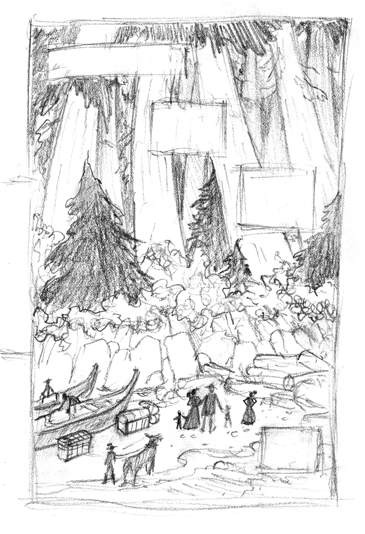
“Cougar Annie” pencil sketch, page 1
When I have everything worked out as far as I can take it on the thumbnails, I usually make a pencil sketch full size. The originals for this comic were to be on 11×17 paper, but this sketch is a bit smaller, as I was trying to get a feel for how much information I could actually put in it, still feeling my way around the composition.
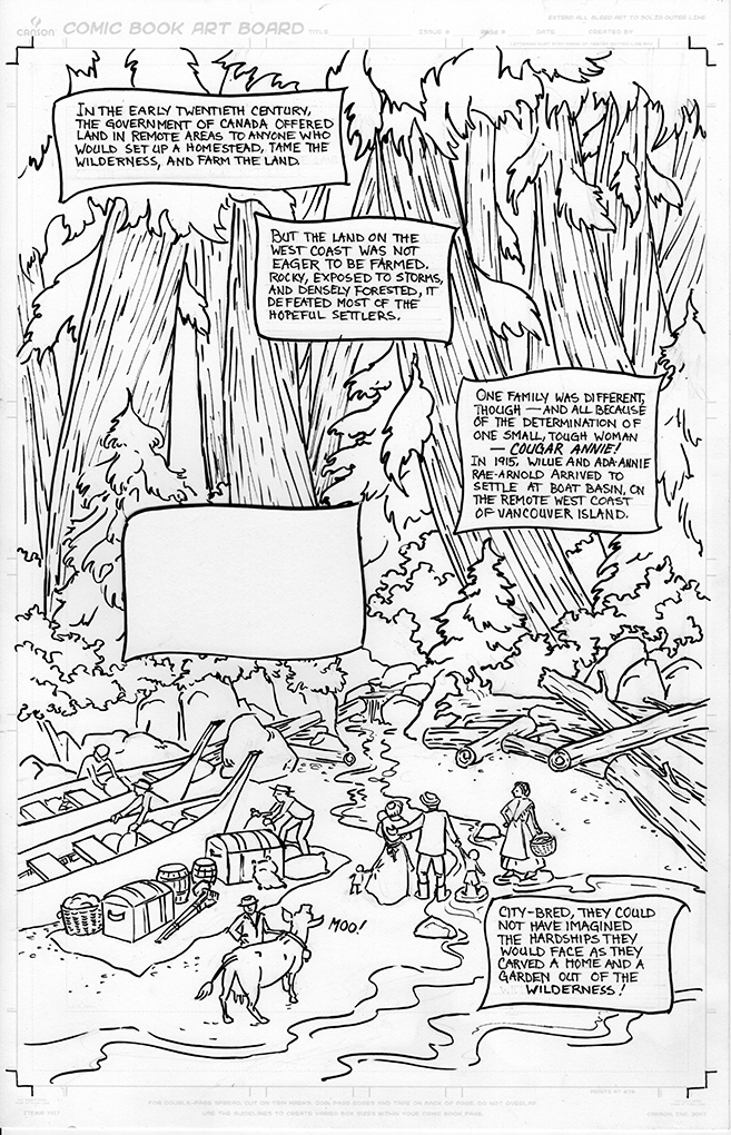
“Cougar Annie” inked, page 1
There are a few changes from the initial pencil sketch here. My teacher thought it would be better to have the family crossing the stream, which would lead the eye up into the woods as a compositional device. I gave them a bit more baggage, too.
If you look at the margins, you can see the markings that come with this paper, which is sold as “comic book art board”. The pre-ruled lines are very handy, and the paper is nice for ink drawing, but not as good for painting in watercolour; I’ve found the same with the bristol paper that lots of artists use, so I’m still looking for the ideal paper for both.

“Cougar Anne” comic page, page 1
Here it is, finished up in watercolour. The title was added on in the computer, because I wanted that “wild west” type of lettering and I’m no good at drawing it! I’ll post the whole story tomorrow so you can read it.

Amazing! You’re such an amazing artist. I wish I could be this good.
LikeLike
Thank you RMX! It’s not something that you’re just born with, though — you learn how through doing it, and practice, practice, practice. I’ve been practicing a loooooong time, and am still learning things, every time I draw or paint something. You can do it too!
LikeLiked by 1 person
Thanks. I am trying. I’m aiming to be a caricaturist! I like taking the piss out of crooked celebrities and politicians. 😀
LikeLike
Go for it — I’ll be cheering you on! I’m not very good at caricature myself, though I’d like to be — I haven’t practiced enough!
Several minutes later — aha! Found your caricatures! You’ve definitely got a knack for this — keep it up!
LikeLike
Hi Karen:
I came upon your wonderful site in search of guidance in the process of adding dialog and caption balloons directly to my ink and watercolor artwork vs. digitally, after scanning as I have been doing previously. This piece and another you did (Professor O’Gumfry) really convinces me to keep trying because I really like the loose, hand-drawn feel.
You say the Canson boards are not good for watercolor yet this is what you used anyway. What was the tradeoff? Did the paper buckle excessively?
Thanks for the inspiration. I look forward to learning many more great things in your Techniques series.
LikeLike
Hi Bruce, thanks for reading! Yes, I really like the hand-lettered look too (as well as the hand-drawn); and I find it doesn’t really take me any more time to do than digital lettering because I get really fussy about spacing and such when I do digital! With the hand-lettered, I don’t have to worry about leaving room for the digital balloons afterwards; it takes the guesswork out of it to integrate it from the beginning. I made a post about lettering in my “Comics Class” series (in the left sidebar menu) that you might enjoy too.
My webcomic, “Mermaid Music” (which you can access from the “webcomic” tab at the top) is all hand-lettered. I use an Ames lettering guide with a T-square for that. If you don’t already use one, I highly recommend it. There is an excellent tutorial on it on the Drawing Words and Writing Pictures site. They also have videos which are an excellent companion to the written tutorial.
I used the Canson Fanboy boards because that is what we were required to use in the class. I’ve since tried a number of other papers, as I was trying to work out the best compromise for ink work and watercolour. I wrote a blog post about the process that you might find helpful. I’ve also tried the Strathmore smooth bristol recently (as opposed to the vellum that a lot of people use) — it’s wonderful for inking, and not too bad for watercolour as long as you don’t want to try for fancy watercolour effects.
Thanks for your comments — I hope you enjoy the articles! If you have your art posted somewhere, please feel free to reply with a link; I’d love to see it.
LikeLike
Hi Karen:
Thanks for the link to your experiments with the different papers. The trade-offs between inking and coloring with watercolors for comics are fascinating, even for a beginner like me.
As for the captions and dialog balloons, I did read your post in the Comics Class series and have studied (and enjoyed!) all the Mermaid Music pages. The Ames guide is a very helpful device (I’ve used it) but the lettering itself isn’t my biggest concern. What I was looking for was guidance about how to reserve space for the lettering even as one creates broad background washes (sky, buildings, etc.) that are usually done with smooth, continuous, wet-on-wet strokes. That is, how does one create an interesting, glazed wash for backgrounds while still reserving white space for balloons?!! For lighter backgrounds with non-staining pigments I guess you could lift out the background to create the balloon spaces, but for darker values or staining pigments do you paint around the white areas? Mask them? This is my biggest question as I try to move from digital to hand-lettering.
LikeLike
Hi Bruce! Wow, thanks for reading all that, and Mermaid Music too! I’m learning a lot from doing such a long-term project (MM), and you may have noticed some simplification of my watercolour style as I’ve gone along. That is on purpose, as I found some of my first pages a little fussy for a comic (a case of over-optimism, too, in the amount of time it would take!).
As for leaving white space: I just paint around it. It can be fiddly, and a challenge to keep all the washes and colour intensities even. The trick is to keep the brush moving and work quickly enough to stay ahead of the drying edges, keeping the paint moving in what amounts to little connected mini-washes. Once you’ve got that down, it’s just a matter of keeping the amount of paint on the brush reasonably constant, and spreading it evenly between mini-washes.
Masking would be another option, though I find that just as fiddly. I hate applying masking fluid; it has to be even more fiddly as a paint-around passage for me to go to the trouble of doing so. Lifting paint out, even with non-staining pigments, won’t give you a clean white, but it could be a nice look if you wanted cloud-like balloons (hmm, might try that myself sometime!).
If you didn’t mind a bit of collage, you could do something that I’ve seen on old comic pages a time or two: make the balloons on a different sheet of paper (maybe trace the shape on a lightbox before you paint) and then paste it on afterwards. Your eventual publishing output is going to be digital, whether you scan for print or web, so it won’t show that it’s a separate piece of paper. This also gives you back some of the flexibility you get with digital balloons, as you can reposition them as needed, or even re-draw them.
LikeLike