This is another post in the series for my comics class, expanding on and illustrating subjects we talked about in class. Yesterday we discussed lettering and colouring; the colouring will be a separate post, sometime in the next few days.
The last thing you want to do is create a powerful script and poetic art but kill any power the story might hold by making your reader aware of the reading experience. — Chris Oatley
Lettering — by hand or computer
Comics which include the written word (as opposed to wordless comics) need to have the lettering incorporated somehow into the picture. The traditional way is to draw it right onto the paper along with the pictorial part of the story, treating it as part of the picture, either by the artist doing the lettering, or a separate person doing it. Another way of working, often used before the days of computers when the letterer was working at a distance from the artist, was to use a copy to lay out where the words would go, making the balloons on a separate piece of paper that could then be cut out and pasted on to the artwork. Nowadays, a great deal of lettering, both in mainstream and indie comics, is done by computer.

A combination of hand and computer lettering in an early version of the Muse cover.
So why learn to letter by hand if it can be done on the computer? The most compelling reason, to me, is that it makes your lettering style seamless with your art style. Only you can letter with the same hand with which you draw, and the stylistic similarity will help integrate your words and pictures. It’s especially good when you’re first learning to make comics because you learn to leave the space for the words as you draw. Other reasons are that you don’t have to deal with the steep learning curve of a layout or drawing program, and you don’t have the expense and dependence on a computer to complete your comic. Also, computer lettering looks like… computer lettering. Unless you get a font made from your own handwriting, it’s never going to match your art quite as well as your own lettering.

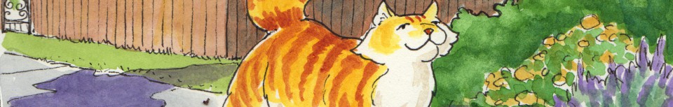
What not to do: the style of “Quadra Cat” is whimsical and kind of airy, so I just use my own handwriting for it; however, it’s not really as legible as I would like, as there are some spacing issues (Hm, could be a pun there). The balloon borders are a little close to the lettering in some places, too.
That said, computer lettering is incredibly convenient, and if you have real problems with legibility, it can make the difference between the reader being able to enjoy your story or giving up in frustration. I use Adobe InDesign when I want to add computer lettering, as it is a full-blown layout program, integrates with Adobe Photoshop (which I use to clean up my pages), and I’m familiar with it. A lot of artists use Adobe Illustrator (which I’m not fluent in — yet); I don’t know if that is preferable — when I learn how I’ll do a blog post on it! Any kind of program where you can draw a balloon and type letters in it can be used — I’ve even used Pages, a layout and word-processing program for Macs, to do quickie comics where I only needed one or two balloons (it even has a balloon shape that you can choose from the shapes menu). One of the main advantages of lettering in the computer is that you can move your balloons around and edit them, including the text, until it is to your liking. Of course this can also be a drawback, if you get so involved in fiddling with it that it takes eons. It’s also handy if you plan for your book to be translated, as other languages sometimes take up different amounts of space.
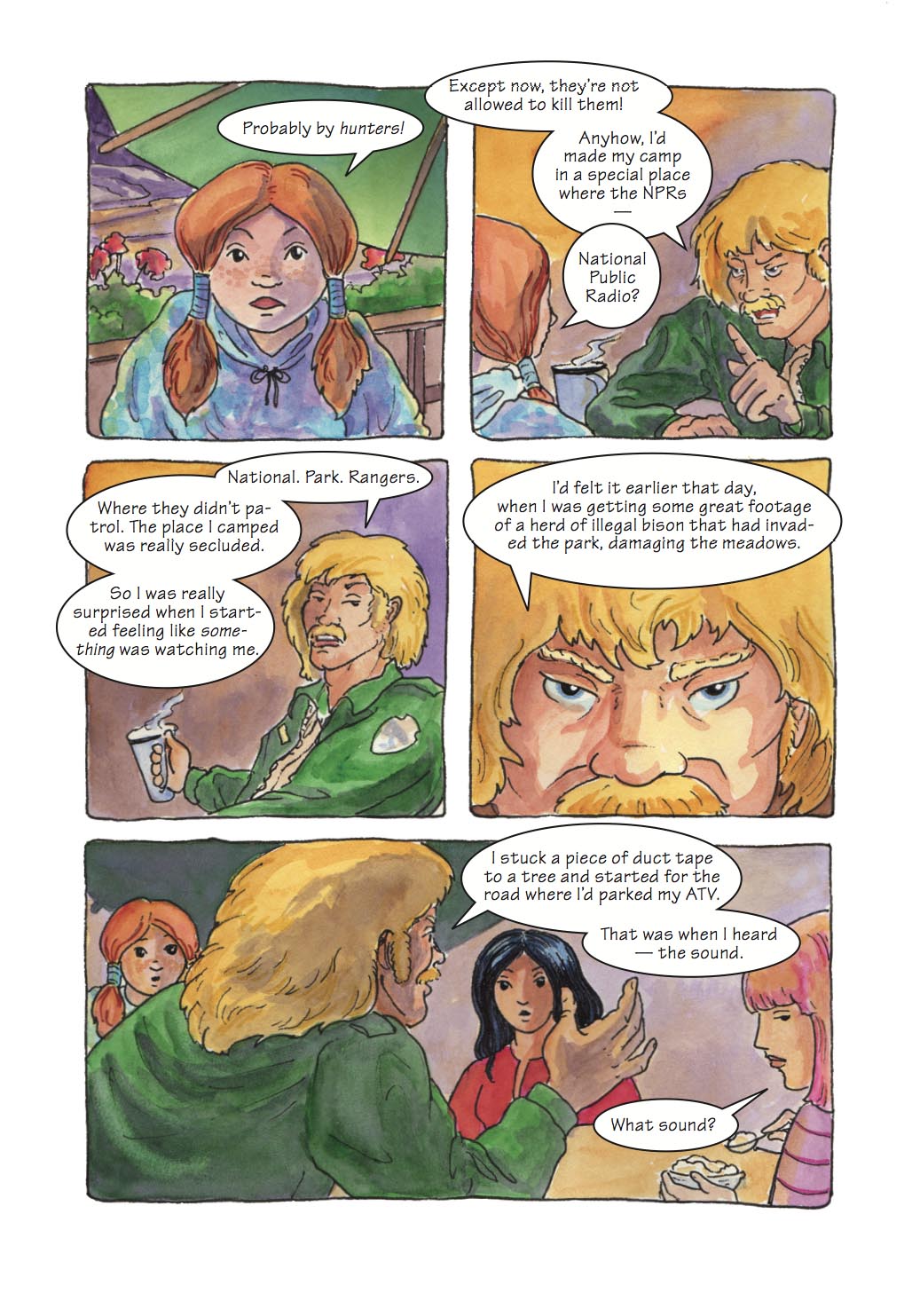
This was a tricky conversation to set up; I had to draw a map of where everyone was at the table, then rotate the views so that the conversation didn’t end up with awkward balloon-crossings. Laid out in InDesign; the font is Noteworthy.
So — you’ve written your story, and drawn it in pencil — what next? If you’re going to put your words and balloons in with a computer (and that’s a whole ‘nother ball ‘o wax), then you can go ahead and ink and colour it. If you’re going to letter it by hand, here are some pointers, rules of thumb, and ideas.
- Lettering comics is more like drawing letters than writing. Remember when you were first learning to print, and you paid a lot of attention to the shapes of the letters? It’s like that.
- Drawing guide lines helps legibility a lot. You can use a ruler or even better, an Ames Lettering Guide with a T-Square. (see link below for a video tutorial) Of course you can choose to letter free-form, and many artists do in indie comics. If you have trouble writing in a straight line, though, it’s a good idea to use some form of guidelines. Another technique is to rule off a piece of paper and put it under your comic on a lightbox or a bright window, and draw the letters using that as a guide.
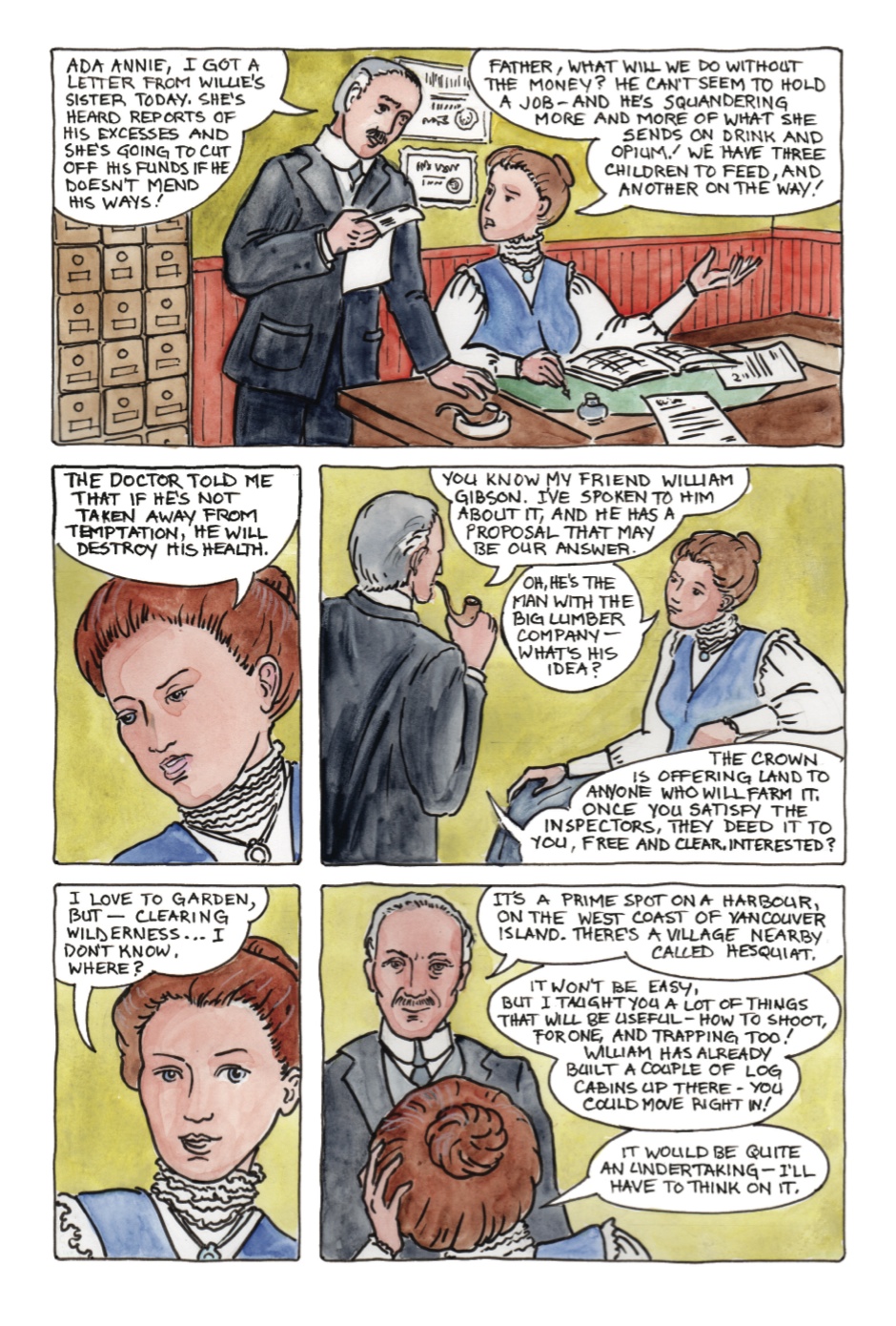
I was really, really glad I had the Ames Lettering Guide to rule off all of this conversation I wanted to fit in to this page!
- Draw the letters in pencil first, then ink, then erase the pencil and line residue. If you try to go directly to ink, it’s really frustrating if you leave out a letter or forget a word! Been there, done that.
- You can use your own handwriting (assuming it’s neat enough to read). Some artists have even used cursive, though since it’s a dying art, some younger people these days may not be able to read it! Print neatly in upper and lower case.
- For classic comic book style, use all upper case.
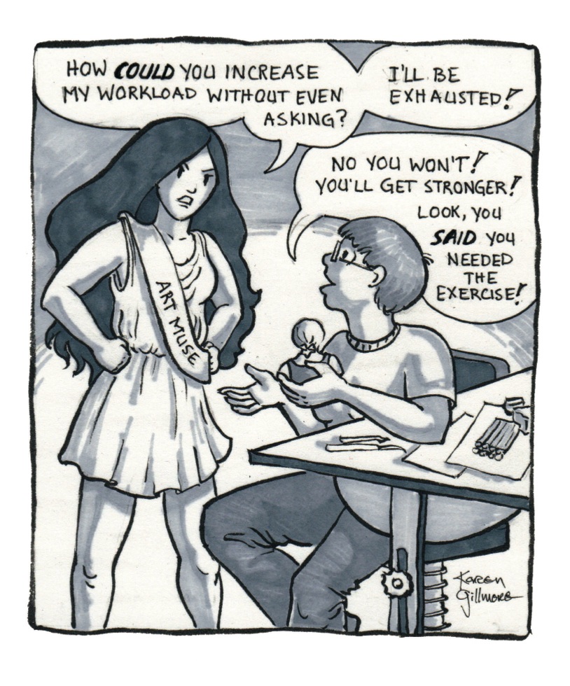
For some reason, I decided to letter all the Muse comics in upper case without ruling lines — I think it might have worked better if I had used more of a hand-writing style, as far as the mood goes, though it is perfectly readable.
- Some people like to use different lettering styles to denote different characters’ speech, for instance, futuristic computer style letters for a robot or spaceman. Or you can use an appropriate type style for an entire story; for instance if you were doing a cowboy story, you could make your lettering look “western”, or if you had a story about medieval monks, they could talk all in gothic letters. The Asterix and Obelix books use different lettering to denote different languages; Walt Kelly’s Pogo uses different typefaces for different voices (see here for a discussion, with illustrations).
- For emphasis, use italics — just draw your letters slanted. You’ll need to leave a different amount of space at the beginning and end of an italic word to make it transition smoothly.
- For loudness, use bold letters; this can be done by switching pen size. If it’s really loud, it might be a sound effect, and you can draw the borders of the letters, then colour them in — in a loud colour, of course!
- Be sure your letters are spaced naturally, without uneven spacing that could be mistaken for spaces or where letters seem to run together. I have issues with this, as my own handwriting tends to be somewhat uneven. I have to remind myself to slow… down… and… just… draw…

Here’s a panel from Mermaid Music, pencilled and ready to be inked and coloured. I used the Ames Lettering Guide for the lines. You can see the finished panel here.
Resources: tutorials
Link to an excellent Ames Lettering Guide Tutorial video in two parts, by the folks at Drawing Words, Writing Pictures.
Here are the diagrams that go with it.
The Drawing Words, Writing Pictures site is the online component of the book by the same name — there is so much there for anyone wanting to learn about comics. Bookmark it, and spend many happy hours reading and trying out their exercises!
Speech Balloons
It sort of seems like the speech balloons section should have come before the lettering section. It doesn’t because in hand-lettering, I like to draw my letters before I make the balloons. This is advisable because you don’t really know how much space the lettering is going to take up until you actually do it. Line out your lettering guide lines (if you use them) in the area where you’ve (hopefully) left enough room for the dialogue. Pencil in the letters, then make the balloon around it.
If you are doing computer lettering, you can put the balloons in first, at roughly the size you want, then put a text box in with the words. If the balloon isn’t the right size you can stretch it or shrink it or change the shape.
- Balloons can be many shapes; the oval is the classic, with the little tail descending to point in the direction of the speaker’s mouth. But they can also be cloud shaped, fanciful, rectangular, or ornamented.
- Balloons can fit into the corners of panels or lop over outside of them.
This balloon fits into the corner of the panel, maximizing the use of the space.
- Make sure there is a comfortable space between your letters and the edges of the balloon. Too small and the letters can feel crowded; too large and the letters can feel isolated and lonely (though this can also be used for effect), and after all, you don’t want to cover up all that lovely artwork! This is an aesthetic decision and there aren’t any set rules; as long as you’re aware of the issue, you’ll probably do it just right by instinct.
The first panel has an example of a continuing conversation with connected balloons. In panel two, I had the challenge of the disparity of heights, so I had to leave room for the tails of both balloons to sort of circumnavigate each other.
- There is an art to arranging the words in the balloons, too. They should roughly follow the shape of the balloon space, which in hand-lettering, is then drawn around them. Generally they will be centred, but in the case of a balloon that is against the edges of the panel, they usually look better left or right justified against the panel edge. Check the flow of the words; if there is a break in an awkward spot, you may need to re-draw your letters to allow the speech to flow better. It’s better not to have long runs of text in one balloon; break sentences up into their own connected balloons.
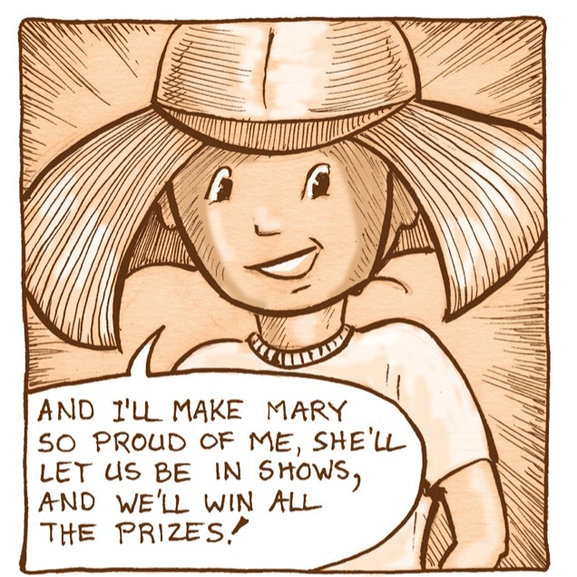
This might be a bit of an extreme example of connected sentences — but it gives the effect of the girl excitedly chattering to her mom.
- Remember to leave room ahead of time when you are planning your artwork! Nothing like having to make the choice between severely editing your words and covering up too much of the art.
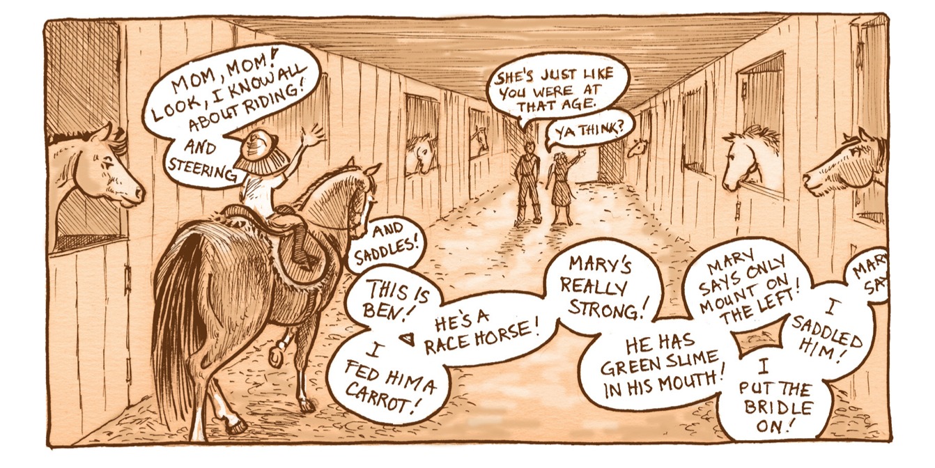
There was a fair bit of conversation to fit into the two upper panels here, so I made sure, script in hand, that I had enough space for the lettering (which I put in later in InDesign) as I planned the panels. Rocky’s last remark, bridging the last two panels, seems to leave behind the second panel and pop out of the third, as does his paw.
- As we read writing and panels left to right and top to bottom, balloons should flow in the same way, otherwise your reader will be confused as to who said what when. If necessary, arrange your characters in the panels so that their words can be read in the proper order. Don’t cross the tails, or have them disappear behind characters or object in order to arrive at the speaker.

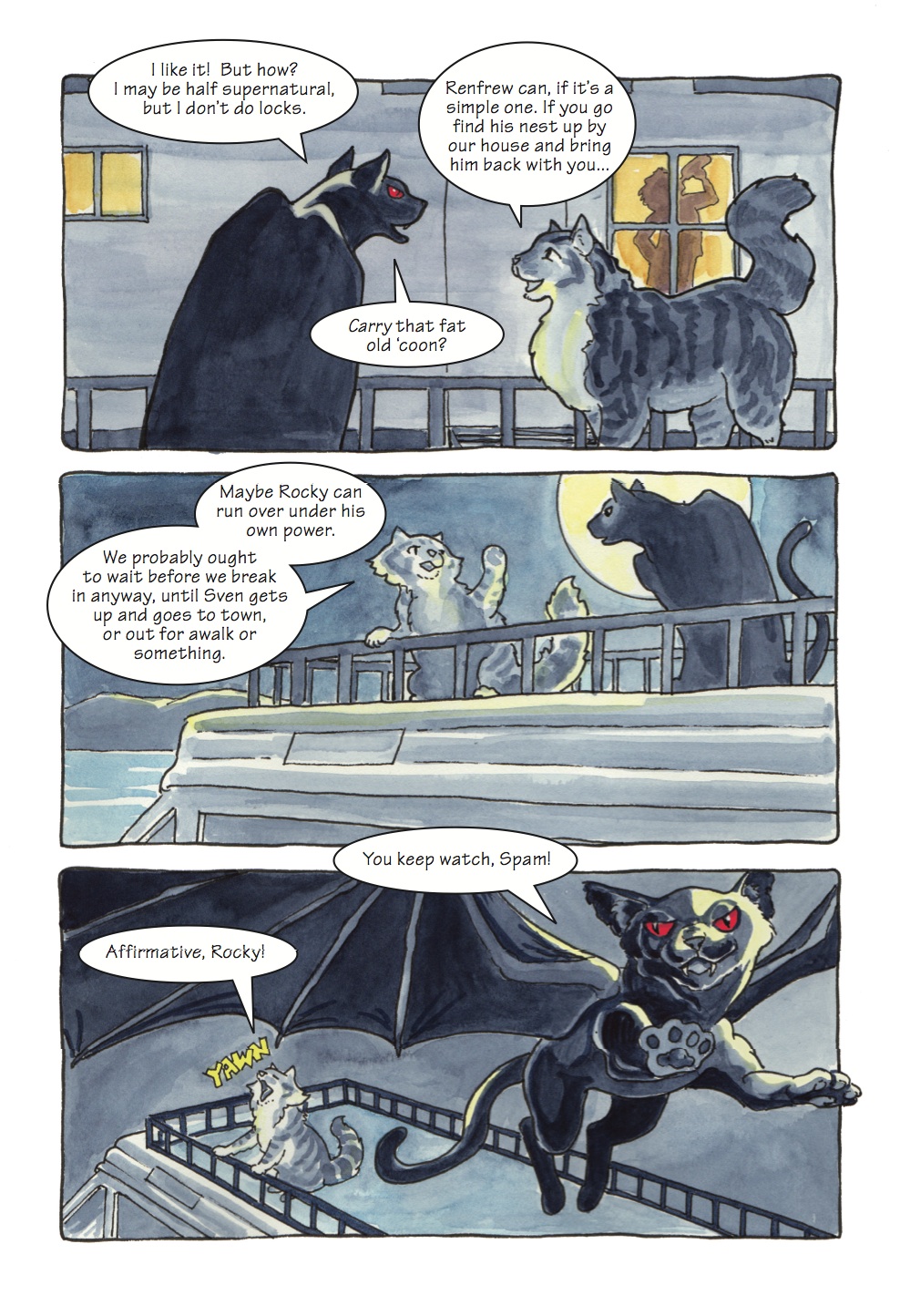
Some of the conversation in this panel is happening “off-camera”; the visual focus is on poor Spammy, recovering from the indignity of being tossed into a parked car, but the conversation is all from the people. I chose to leave most of the tails off of the balloons to give the effect of disconnected voices being heard by Spam in his swoon.
Resources: For further reading
Good ol’ Wikipedia has a thorough treatment of the history of the speech balloon, with illustrations.
Here’s an excellent article on comic balloons and clarity from Chris Oatley, whom I quoted at the beginning of this post. His site is worth settling down with a cup of tea and doing some exploring; I have only scratched the surface, but it looks like a great resource. Here’s another article that covers several of the points I’ve mentioned with excellent illustrations.
A useful and clear guide from Blambot showing lots of different ways to letter, and different ways to arrange balloons.
Here’s a rather scholarly article about the history of the speech balloon.
As always, I’m collecting links of interest in my Pinterest board, “Cartooning and Animation Resources“, so check that out for more.

Hi Karen! Wow…it’s been a long time! Loved this post…learned a few things for some projects that are developing 🙂 Hope all is super in your world …Happy Valentine’s Day!
LikeLike
Hi Lorrie! Happy Valentine’s Day to you too!
Glad you liked the post — are you going to do some hand-lettering of your poetry? It’s been a while since I’ve popped over your way — I’ll have a look!
LikeLike