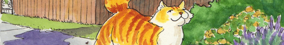
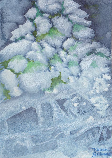
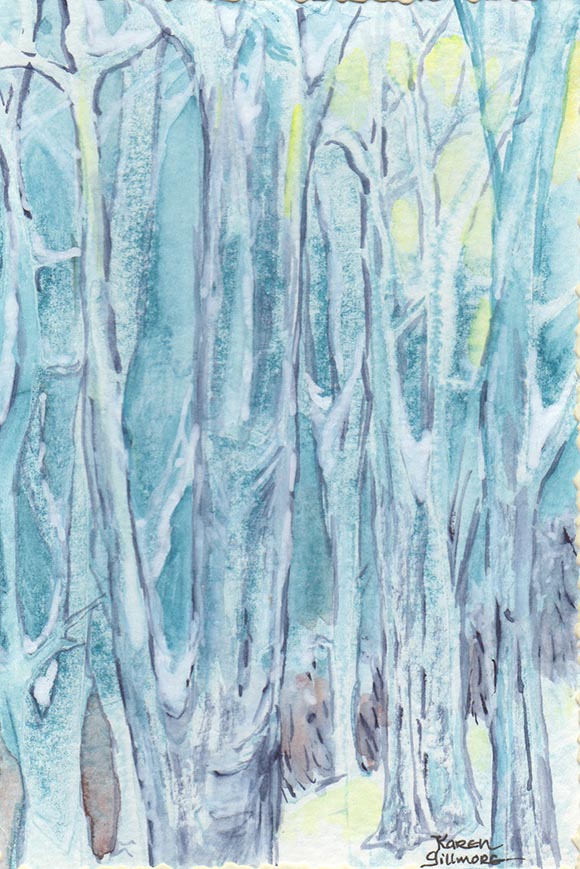
Every Saturday I post about some aspect of art technique. This week’s technique is more of a pre-technique. I’m a strong believer in knowing your materials, in order to get the most out of them. It also helps to know what you’re looking for when you go to the art supply store — you’ll save a lot of money and frustration! So today I’m offering an excerpt from my watercolour class handout, on the basics of watercolour paint. I’ll put in a few little paintings for colour, too — If you’d like to check out some of the techniques used to make them, see my post “How to be a Watercolour Wizard”.
So, what exactly are watercolour paints? As with any paint, they are pigments dispersed in a binder; in this case gum arabic, which sticks the pigment together and to the paper. Watercolour paints also contain other ingredients such as sugar or honey water for a plasticizer, glycerin to keep the paint moist, a wetting agent to obtain a uniform flow of paint, and preservatives. These are added in varying amounts in response to the properties of the pigment; formulating paint is a highly developed science, as well as an art in itself!

Every manufacturer has its own slightly different colour mix, due to patented processes. You will find that the better brands offer their paints in “series”, with different colours being priced according to the expense of the pigments used. The less expensive student grade paints are generally all one price, and the manufacturers have evened out the cost by replacing expensive pigments with cheaper ones which give a similar colour. Thus in a less expensive paint, you will see the word “hue” after a common pigment name such as cadmium red. This means that “cadmium red hue” is not cadmium red, but a blend of other less expensive pigments that approximates the colour of real cadmium red. “Hue” is also used in some cases where a “fugitive”, or easily faded, traditional colour is replaced with a more durable modern substitute, or where the traditional pigment may raise safety concerns due to toxicity. The substitution of pigments is not necessarily a bad thing, but be aware that the “hue” pigments may handle differently than their original namesake. If you are interested in getting really geeky about pigments, every pigment has been assigned a number, and paint tubes are sometimes labeled with the numbers of the pigments used. The Wilcox Guide to the Finest Watercolours is a book that is a must-have if you are so inclined.

Some cheaper colours may also have more coarsely ground pigments, less expensive binders, or less pigment in relation to the binder — all of which affect the working qualities of the paint. Don’t skimp on your paint quality. Ask for a good artist-quality paint or a student quality by a reputable brand; they might be pricey but you will get so much better results — it is better to have just a few really good tubes of paint than a whole lot of second-rate ones.

The best way to find out what your particular colours will do is to make mixing charts and try them out. Try all your blues with all your yellows to see what greens you can make. Try all your reds with all your blues to see what purples result. Likewise with your yellows and reds for oranges. Then see what happens when you mix earth tones with various colours. You will be surprised at the incredible and subtle range you can get with 6 or 8 colours! Try them on some different papers, too — watercolour paper makes an incredible difference in the effects you can get!
Watercolour pigments come in various states of transparency or opaqueness, and some are staining, instantly bonding permanently with the paper fibers, while others can be lifted back off of the paper until it is white again. The more you paint, the more you will get to know the qualities and abilities of each pigment. Besides its unique colour, each paint has unique handling qualities. Transparency vs. Opacity, Staining vs. Non-Staining, granulating (sedimenting) or smooth — you can read up on these qualities, or discover them as you explore your paintbox. Manufacturers’ charts (on-line or posted in your art supply store) are very handy for reference until you get the hang of your paints’ individual personalities.
I’m often asked what a good starter palette would be for a beginning painter (or someone who is interested in simplicity!). Here is a fairly traditional palette that has both warm and cool of each primary, some earth colours, and some extras:
Primaries:
Ultramarine Blue
Cerulean Blue
New Gamboge
Lemon Yellow
Cadmium Red
Alizarin Crimson
Earth colours:
Burnt Sienna
Burnt Umber
Yellow Ochre
Extras:
Hookers Green
Sap Green
Payne’s Grey (you can approximate this by mixing Ultramarine Blue and Burnt Sienna or Burnt Umber)
And my very favourite colour that I would choose if marooned on a desert island with only one colour of paint: Daniel Smith Indigo
If you’re interested in a little further exploration, here are some links:
Winsor-Newton’s page on the History of Pigments
Daniel Smith’s video on making paint (the actual paint-making part starts about 3 minutes in, and shows paint being made from lapis lazuli rock! I use mostly Daniel Smith and Winsor Newton paints.
A PDF from Opus, where I do most of my art supply shopping, about paints
A wonderful exploration of pigments from WebExhibits, a public service of the Institute for Dynamic Educational Advancement (IDEA)
