Today I painted the first double-page spread of Spam and the Sasquatch, and took pictures as I did each stage! So follow along if you like, and help me celebrate getting started on the next stage of this graphic novel!

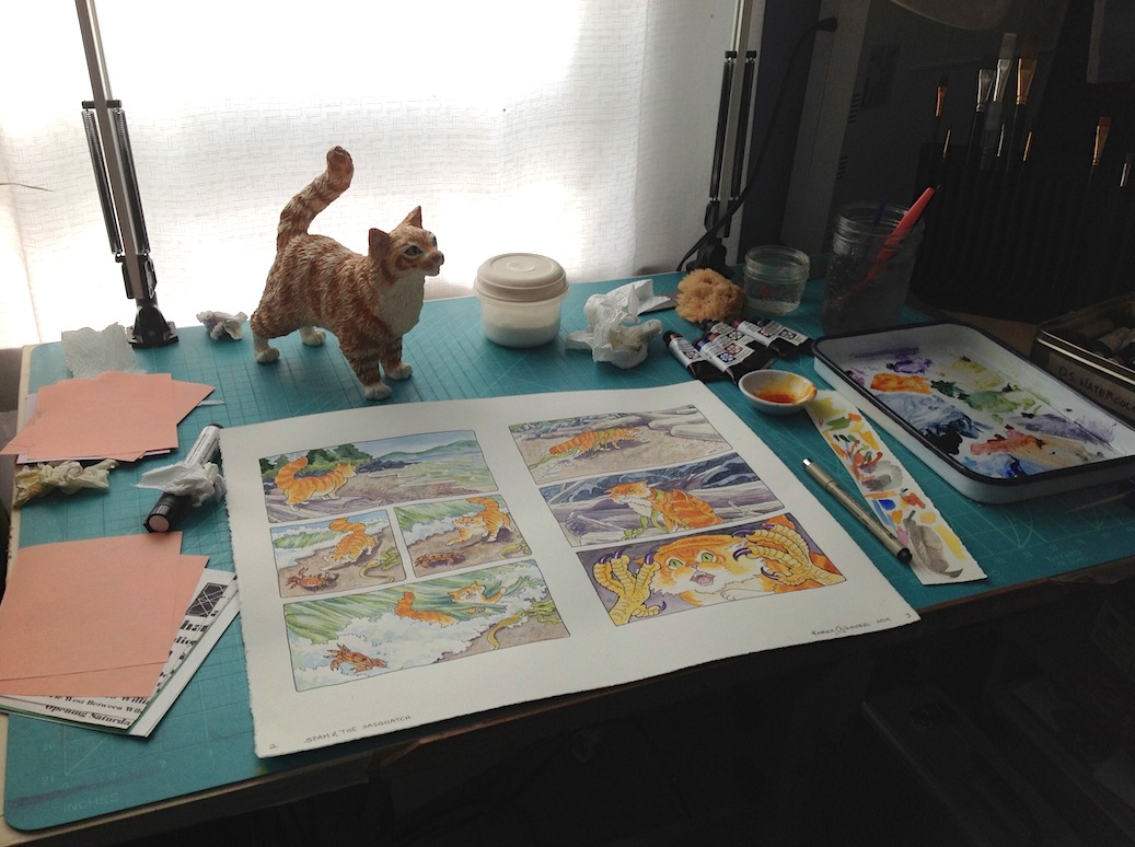
Ready to start! I’ve got everything I need, mostly… but I always think of stuff I forgot to get out. I’ve got great light though a south-west facing window with a nice view over the town; when the sun comes around to that side of the house I have a white curtain I can pull to cut the glare.
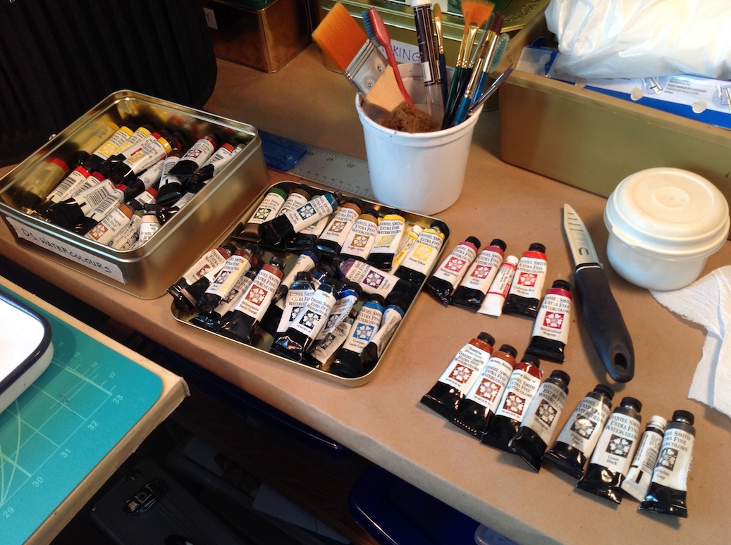
I’m using Daniel Smith watercolours, mostly. No, I won’t use all these, I just wanted to take them out and see what I had in case I wanted to expand my usual palette.
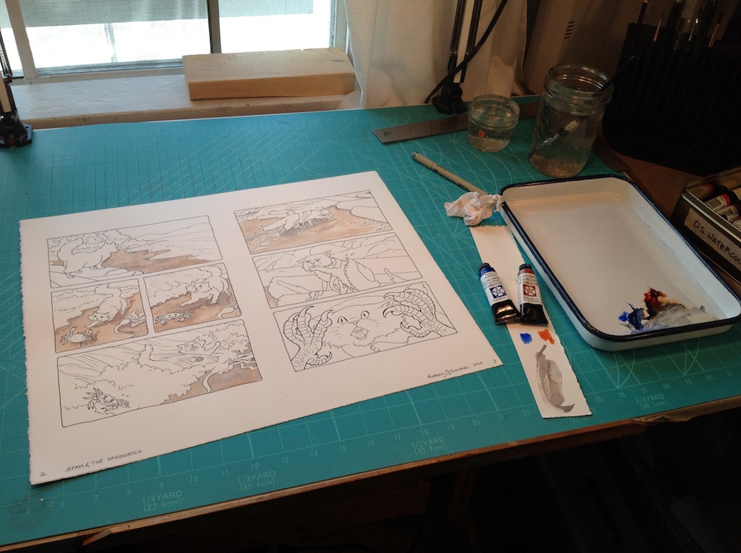
I’m starting with the backgrounds. That’s usually a safe warm-up for me.
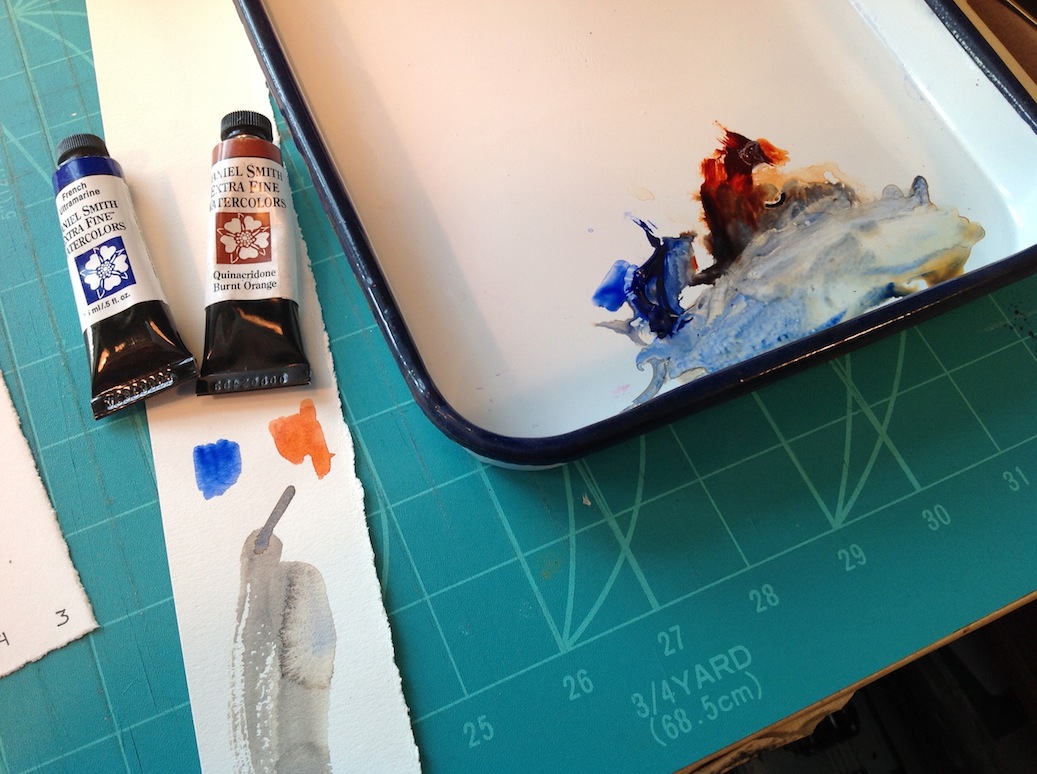
French Ultramarine and Quinacridone Burnt Orange make a beautiful grey that approximates the colours of our local beaches. I put them next to each other on the palette (which is an enamelled “Chinese butcher tray”, and mix them in between, making them more blue or orange as the need arises.

Here I tried using some Lunar Black, which is a wonderful granulating neutral black (grey when diluted); however, I thought it was TOO neutral, but it was a good start to get the values laid in, anyway.

I added some indigo — the Daniel Smith indigo is deep and rich and I use it a lot. It makes great shadows. If I could only ever have one colour to take with me to a desert island (why do these choices always involve desert islands?), it would be this one.

A close-up of the indigo — I sprinkled a dash of salt into the wet paint as I did each small area (you’ve got to be FAST!), to give the rocks some texture.
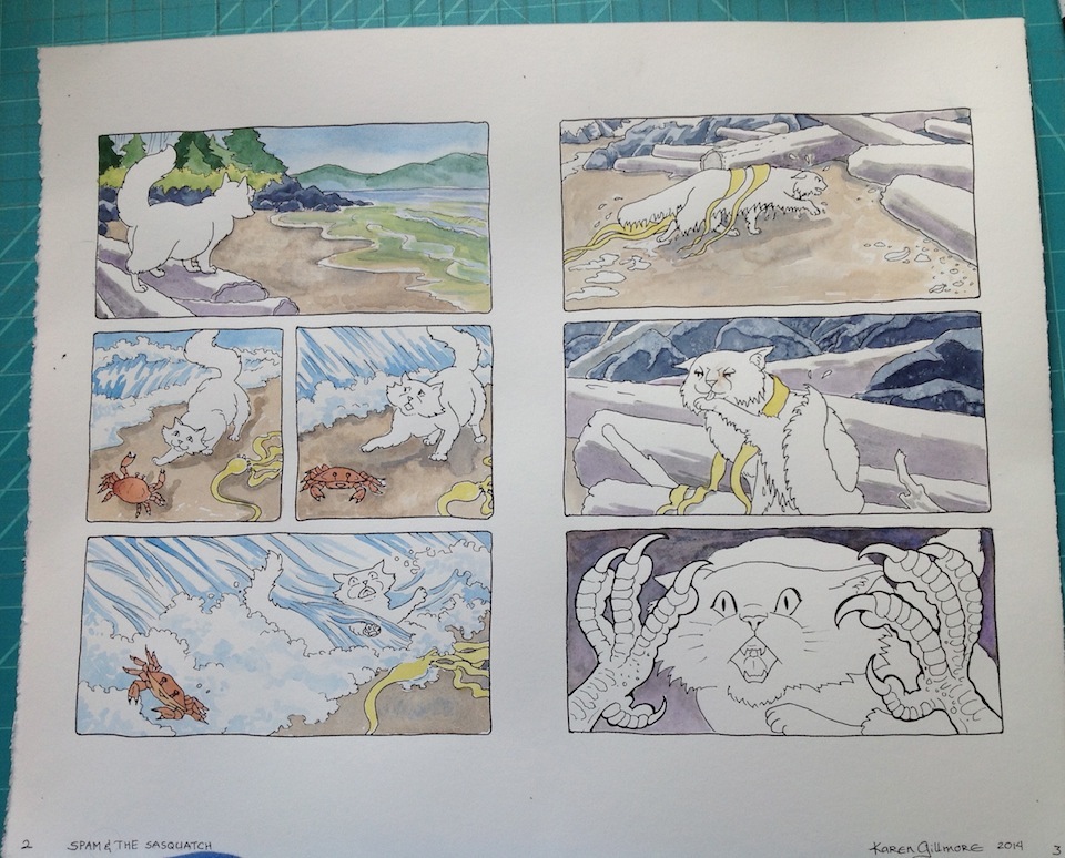
Starting to add some small details now. The seaweed is a colour called “rich green gold” and it has a yellow undertone when used thinly, but the mass tone (thick paint) is like a sap green. The blue in the waves is cerulean.

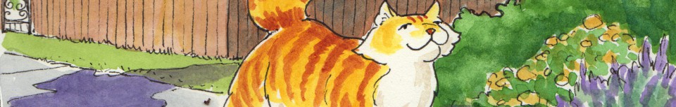
At last! Spam’s undercoat is New Gamboge, mixed with Quinacridone Burnt Orange.
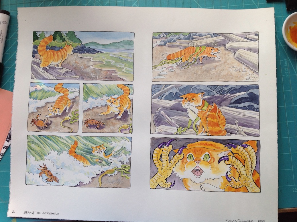
Spam gets stripes (more Quinacridone Burnt Orange), and other little details are filled in, adjusting the values and such. I put some texture into the sand with a sponge and added some highlights with a white opaque Pitt marker.
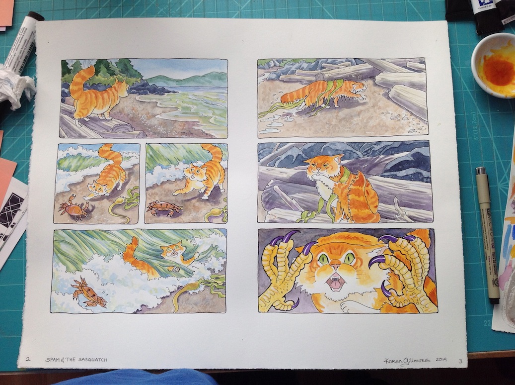
Some final adjustments in the shadows. If I do anything more, I’ll do it in Photoshop — I may put Spam’s surprised face into shadow using Photoshop; it’s really difficult to get the colours right with a glaze when the base colour is yellow. Get’s muddy-green really easily.
Oh my, what a mess I made! Time to clean up and get on to the next page!

Poor Spam – it looks like a bad day on the beach.
LikeLike
And it started out so nice, too!
LikeLike
Thanks Karen for sharing your colouring process! It is great to see all the steps. And I like the colours!
LikeLike
Thanks, Ulla! So far, so good!
LikeLike