Days like this keep me humble. I put aside the inking of the story I’ve been working on in order to try painting the first page, which I had put off because I knew it was going to be complicated, and even with some advice (and a couple of demonstrations by my mentor, I’d been procrastinating. One of the suggestions he had for me was to do very loose, forceful strokes for the forest and the fire, something I wouldn’t have tried (or even thought of) on my own. I was going to use a brush and some transparent acrylic ink, but found that I had exactly the colour I wanted to start with in a Pigma Micron brush pen that I’ve had for ages. And things escalated from there…
I’m not entirely satisfied with this effort (yet) — I may still be able to tweak it into submission. At this stage it’s unfinished, but I’m going to post it anyway, because I’ve been working on it ALL DAY and, well… *whimper*… OK, I know that’s not a good reason, but here it is, in hopes that others may learn from my mistakes.

My first mistake was that I forgot to scan it when I had the basic drawing down! I inked the stuff I wanted to have a black line around, and penciled the rest. But I got so excited about my purple brush pen that I started before I remembered to scan.
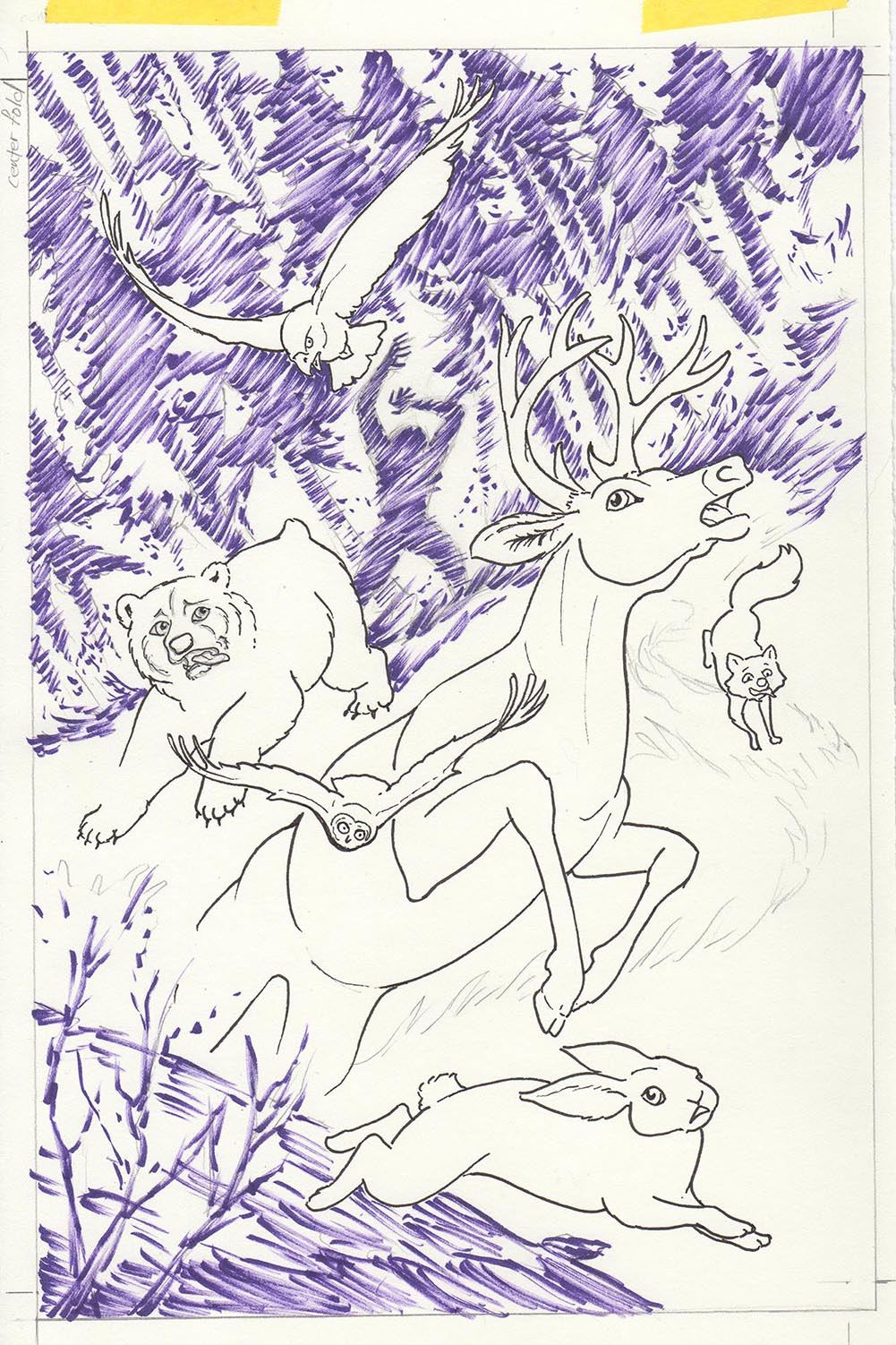
So far so good — This was fun! In fact, it was so much fun, I ran down to the art store and bought a handful of markers in fire colours to continue this effect. I was just going to use watercolour, *sigh*

The scanner made the yellow here look greener than it actually is.

Adding in some oranges. Still looking pretty good.
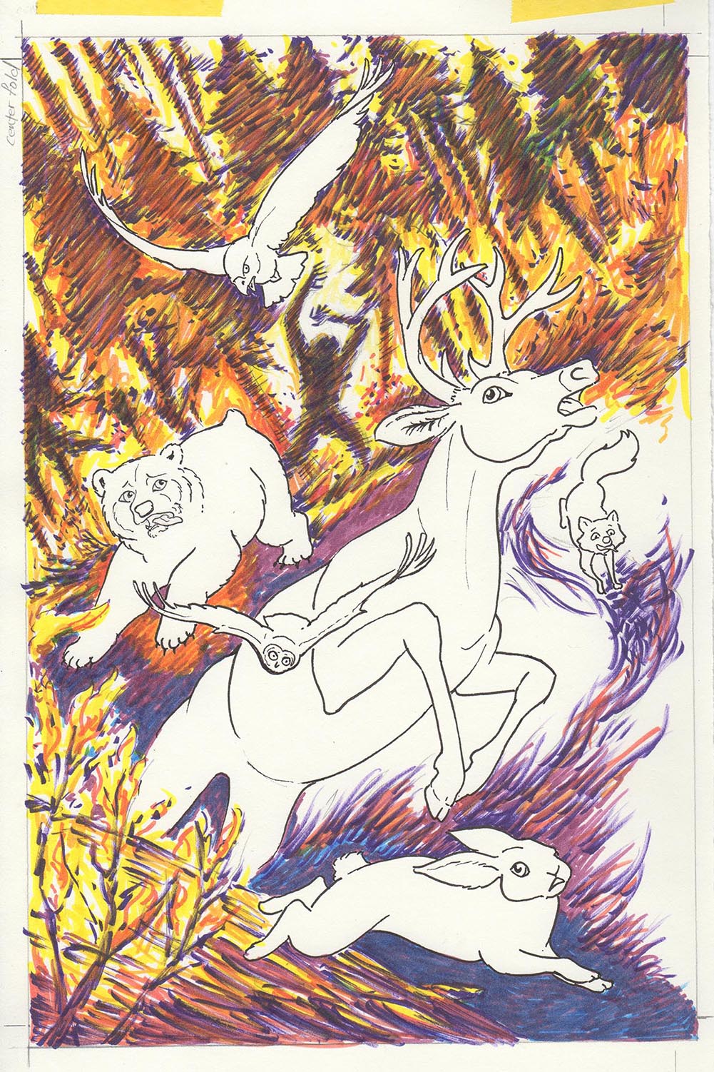
I was starting to dig the Van Gogh effect I was getting. But I stopped paying attention to the overall effect because I was having toooo much fun!

OK…. not so bad. In fact the background is kind of neat, but eventually I knew I was going to have to do the critters.
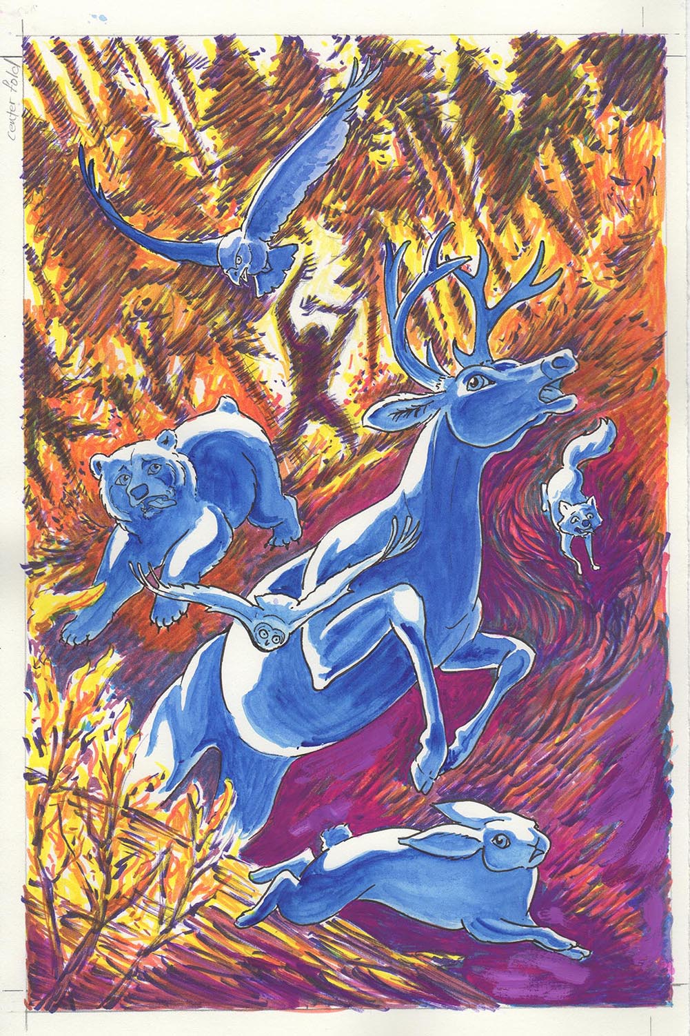
My mentor’s demonstration of a very quick computer colouring looked good, so I tried to emulate the colour scheme. This is a lot brighter colours than I would have used, and probably it just doesn’t translate onto paper from the screen. Much adjusting is in order. I felt that the Van Gogh effect was a little too much after I started painting the animals, so I got out the gouache and started flattening out the shadows. I also felt that the markers were a bit flat looking, so I started warming up the dark bits with gouache and transparent watercolour.

This is as far as I’ve gotten tonight. Lots of tweaking of values and hue is going to have to happen to this before I pronounce it worthy. I may just do it over again, but not until I give it as much as I can. I’m tenacious that way. Thank goodness for gouache.

You are awesome!
LikeLiked by 2 people
Awwww. Thanks, Sweetie, I needed that!
LikeLike
Thanks for showing us your colouring process, very interesting as I have some ideas for figurative stuff but no idea how to go about it. I’ll never reach your level of course, but that’s irrelevant. 😉
LikeLike
HI Pia! Not so sure about the levels thing — we just do different kinds of stuff, is all. The only way to learn anything in art is to just do it. You’ll find your own way, and it will be wonderful!
LikeLike
Thanks for showing your working process. I like the result so far very much. I’m into the colouring process as well, but doing it digitally with photoshop. I like how you can change the colours without damaging the painting doing it this way.
LikeLike
Thanks, Ulla! And oddly enough, today my mentor took where I’d gotten to on this piece, popped it into Photoshop, and showed me a bunch of stuff I could do better. Then we talked about how to do it with traditional materials. I’ll keep the scans as I go along, though, just in case at some point I need to bail and fix it digitally!
LikeLiked by 1 person
Pingback: Dialogue Balloons and Caption Boxes, Oh my! | Karen Gillmore Art·