Making a graphic novel involves a lot of steps! I’m getting close to finishing the artwork, and running all the pages through Photoshop to get each one ready for publication. I picked one page for today, and will explain what I did in the captions, from pencils to finished image ready to pop the dialogue into. It’s a bit of a departure from my usual Technique posts, but I hope you find it enjoyable.
I’m not any kind of an expert in Photoshop — really I’m a complete newbie, and only know how to do a few things! — but I’m getting secure with some of the simpler operations, and having more fun with each new trick I pick up. My mentor, Ken Steacy, has been very generous with his patience and his time in showing me a lot of stuff (sometimes several times until I got it), and I’ve figured out a few things on my own through messing around. If you aren’t interested in Photoshop, I hope you still find the development of the page interesting; if you are interested in Photoshop, but haven’t done much with it, you might find something of use here. And if you’re a Photoshop whiz, i welcome suggestions!
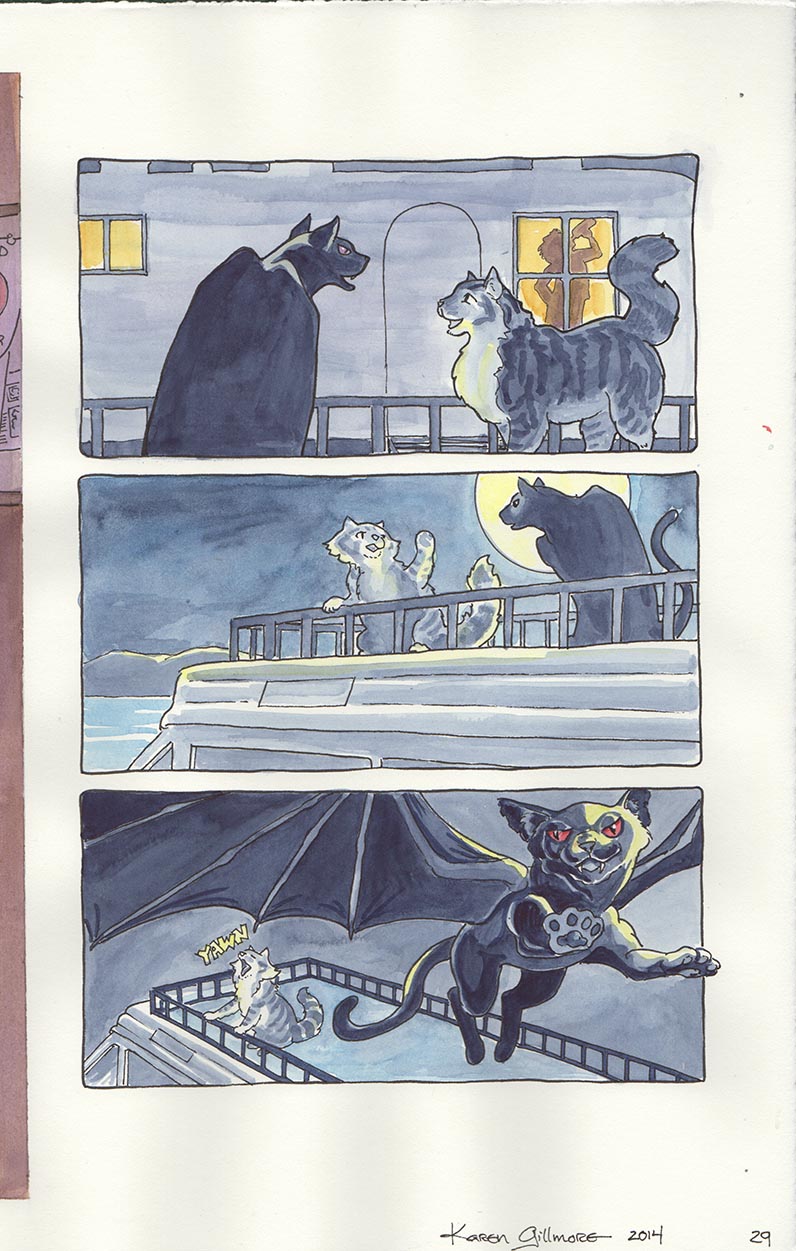
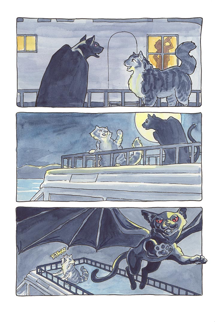
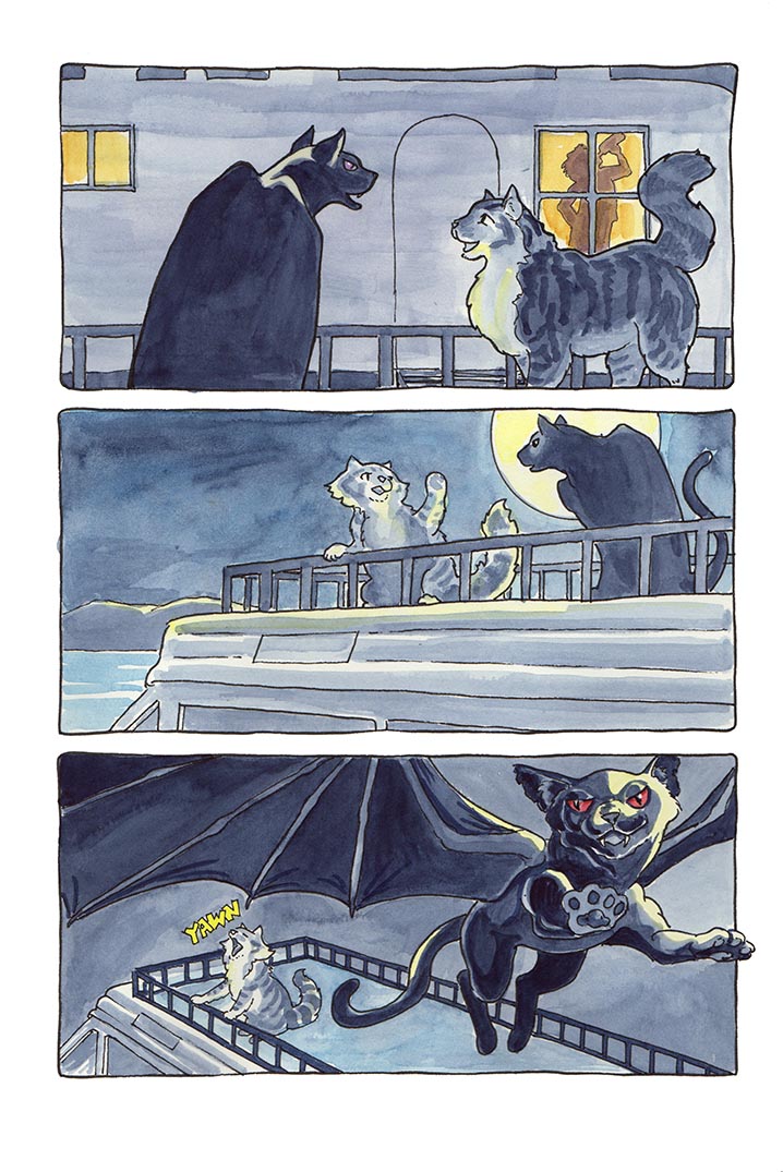
The Evolution of Page 29 of Spam and the Sasquatch: Spam and Rocky are discussing strategy, atop the camper next to Sven’s Airstream.
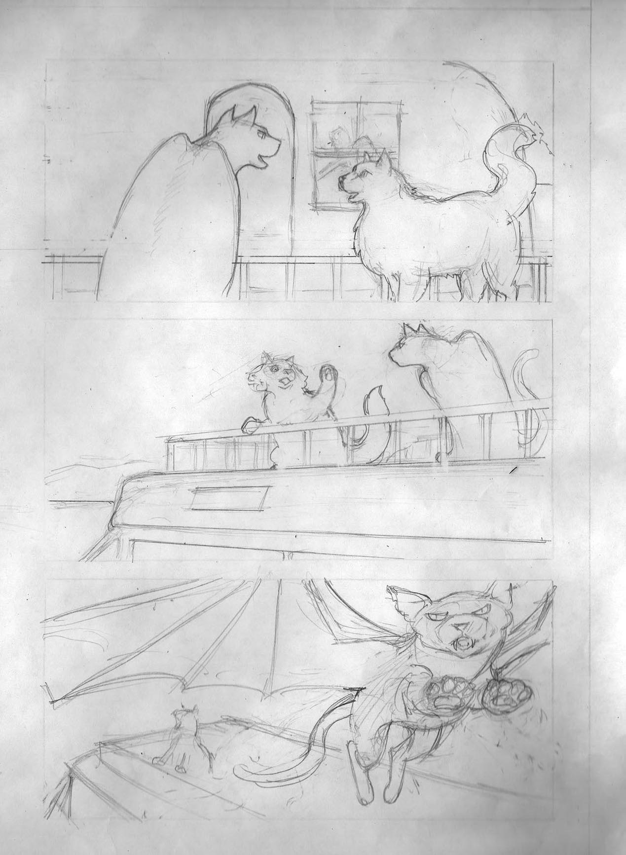
Here are the pencils. I did these on cartridge paper (thin paper like copier paper) so that I could trace over them in ink on good paper using the lightbox. When I scanned them, I got a lot of shadows, because I didn’t shut the scanner lid to press them down. This was OK because all I wanted was a rough record in case anything happened to the original pencils, but normally you wouldn’t want to do this.
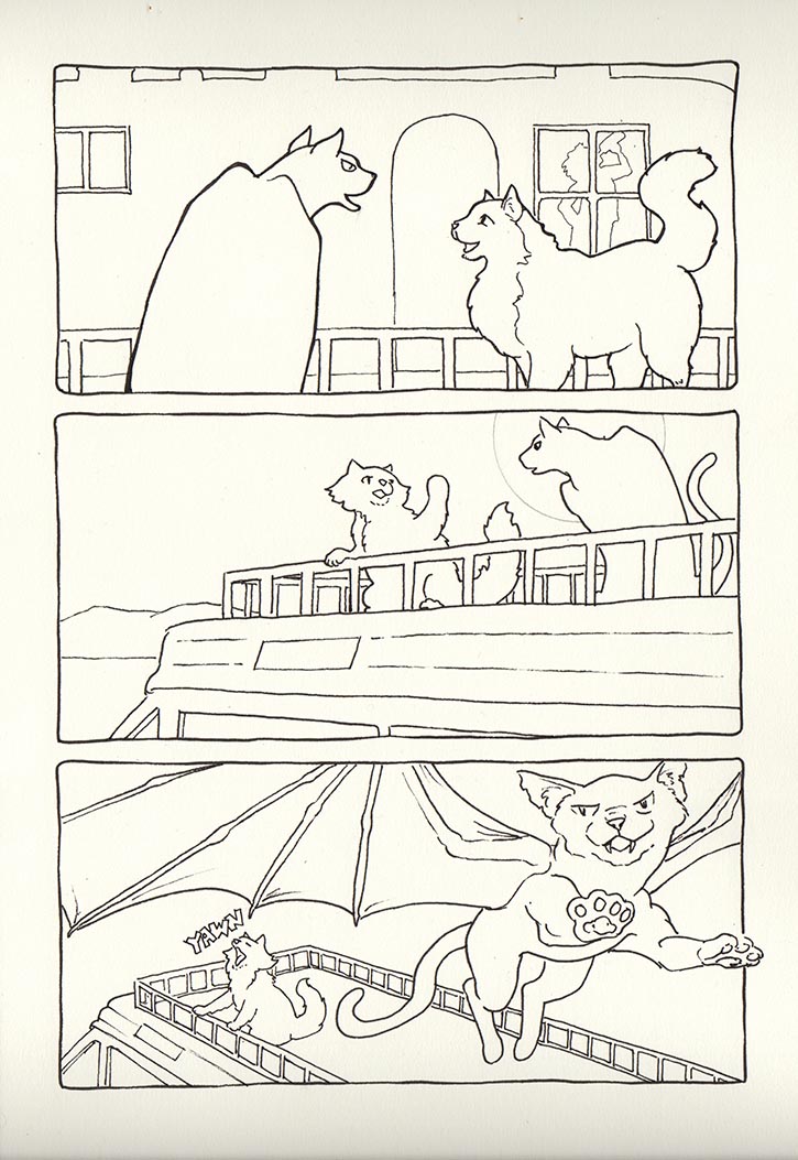
Here is the inked version, on Opus Watermedia Paper. It is slightly off-white, thus the colour. Note the difference in the position of the window and the outline of Sven’s shadow in it from the pencils (top panel); in the bottom panel, Rocky’s paw has been shifted outside the panel border to make him seem to be bursting out of it. (This was Ken’s idea) I also hadn’t decided for sure where the moon was to be at the time I scanned this, so it is in pencil. The shadow on the bottom of the scan is due to scanning the full two page spread at one time, which doesn’t quite fit in the scanner. Again, not recommended if you are trying to get a scan that is usable for purposes other than archival.
The raw scan of the finished page. Because I did these in double page spreads, the edge of the full-bleed opposite page shows on the left. The paper was wrinkly due to the watercolour, and shows shadows in the margins, even though I put it under weights. The wrinkles will eventually flatten out if kept under weights, but it takes a while. There are also some smudges from misplaced paint. But never fear, Photoshop is here!
The first thing I do is “Save As”, so that in case things go wrong I still have the original scan to go back to. I don’t usually save all the steps that I did here, just the original scan and the final version. But if in doubt, save the interim steps; you can always trash them later! After I Saved it, I cropped it to the little dots that I made to show where my page edges were (you can see these in the previous picture). Normally I would have full-sized crop marks, in order to align the image exactly with my layout document, but because my panel borders are free-form rather than drawn with a ruler, placement in the layout can be done by eyeballing it. My dots are actually pretty accurate, though. In this step I also cleaned up all those shadows; I select the whole border area by clicking anywhere in it with the magic wand tool (sometimes the shadows are too dark and I have to mess with the tolerance levels — usually it’s set to about 50), then drop white into the selection with the paint bucket tool. It’s fun to see the instant difference cleaning up the borders makes, rather like putting a painting in a frame.
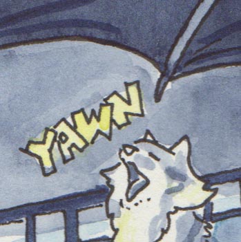
I’ve been cleaning up all the hand-drawn sound effects (most of the lettering will be put in with InDesign, using fonts). It’s very hard to paint these accurately and brightly when they are so small, so I just put placeholder colours in with watercolour, knowing I could spruce it up in Photoshop.
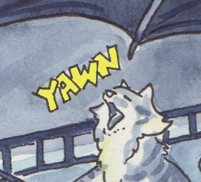
I used the same technique as for the borders, selecting the yellow with the magic wand. However, the edges were kind of messy, so I used the “quick mask” to edit them. It has taken me a while to understand just what this tool was doing, but repeated lessons finally got through my dense noggin — it is essentially like using that gooey stuff made for masking watercolours, only a lot neater and not smelly at all! After you’ve made your selection (or even before if you just want to edit the mask from scratch) you hit the “Q” key, and everything turns pink that isn’t selected. You can then use the pencil or brush tool to add to it and reduce the selection, or use the eraser tool and take parts of the pink away to increase the selection. Nifty! I’ve decided that half the battle with Photoshop is learning how to select stuff.
After I had the selection done to my satisfaction, it was easy to drop in colour with the paint bucket. I could also have just swiped across it with a brush or a pencil, since only the things inside the selection would be affected.
The last thing I did was something that Ken suggested that I do for all my pages, and that was to go to the Image menu and thence to Adjustments, where the Levels panel resides. The scans were just a bit washed out looking, so I moved the slider for the darks over just a bit to make the colours a bit richer. Compare this with the earlier colour version. I found that Rocky’s yellow highlights then needed a bit of brightening up, so I selected them as above and messed around with different tints of yellow until I had what I wanted.
The next step for all this is to import it into an InDesign document, which I set up yesterday, with Ken’s help. InDesign is a formidable layout program, of which I understand just enough to do the layout for my book (having done one already last year). I’ve also used other layout programs, not so powerful, that had similar functions, so it was actually much easier for me to understand than Photoshop, initially. In InDesign, after the pages are all in place, I’ll then make the word balloons and type in the dialogue. Oh, and before that — I get to go shopping for some good comic fonts!

Great walk thru! I do some of the same steps when doing my landscape plans. Lots of copies along the way when I start using pens instead of erasable pencils.
LikeLike
Good idea — when it gets to be permanent, it’s good to have all the steps. I’m starting to get that Photoshop mentality, though, where when I make a blotch I think “I’l just fix it in PS” — have to be careful that that doesn’t make me a sloppy painter! I’m keeping in mind that I want to be able to sell the originals if anyone should want them…
LikeLike
Nice step by step guide. At what dpi do you scan the original?
LikeLike
Thanks, Ben! I scan them at 300 dpi, standard for printing. Since I’m shrinking them a bit for the printing, anything more would be overkill.
LikeLike