Why are mermaids always maids? What do you call a boy, er, mermaid? Merboy? Merlad? A grown male mer-person is a merman, or sometimes, a triton (though they usually have two fishy tails). And what do you call an older mermaid? Merlady? Merwoman? Mercrone? And then there’s the issue of mer-people being half fish. My undersea people in my webcomic, Mermaid Music, are more like half dolphin — seems a lot more sensible to meld two mammals than a mammal and a fish!
So I’ve settled for their own word for each other being Hands, as opposed to the Fins, their dolphin buddies. I’m currently in the middle of a 4-page scene in the webcomic where the first Hands and Fin characters have been introduced, and I’m having such fun painting it that I decided to do an in-progress breakdown of the steps for the latest page. So dive in!

First of all, I’m using Opus Watermedia Paper, which is fairly smooth for drawing, but nice to paint on. It’s not slick like hot pressed papers, and is pretty tough, which I need to stand up to all the erasing abuse I subject it to (I’m a really messy sketcher).
I’ve tried something a little different than my usual inking style here. I used a Pigma Micron dark blue pen instead of black for outlines of panels, balloons, and for the lettering. Then I used an indigo Prismacolor Col-Erase pencil for the rest of the drawing. I’ve been unhappy with the line I’ve been getting with the pen for my drawings; it seems mechanical, since there is very little variation. I find dip pens make me get too fiddly, and I tried a brush but really I need to put in way more brush-lining hours before I feel really capable — and I needed something to make this look good now. I’m very happy with the Col-Erase (and delighted to discover that they come in more colours than the red and blue of my childhood!), though I wish it were a bit darker. More on that later.

This is the first layer of watercolour. Garish, I know. But this is only the undercoat. Be patient. That lovely sky-blue is Daniel Smith Manganese Blue Hue (all my paints here are Daniel Smith), a colour I like not only because it’s pretty, but because it lifts well, is transparent, and goes easily from the lightest tint to a mid-value colour. The gold is Quinacridone Gold, which when used thickly like this is almost orange, but when thinned goes more toward a soft, clear yellow. Thinned out, it makes a nice transparent glaze to warm an area up and bring it together. Whelk’s hair (the girl) is Indian Red, which is pretty opaque, but has pinkish tones when thinned — perfect to go with her Carbazole Violet tail. It also lifts nicely for highlights. The Hands’ seaweed carrying harnesses are Sap Green, and the Chirikik the Fin’s body and the portholes of the ship are Indigo. The skin colour is a mix of Burnt Sienna and Quinacridone Magenta. Gull, the boy, has hair of Yellow Ochre.
Whew, that was a lot of colours! Not so many new ones from now on. Things quickly developed some value definition in the second coat. I used Carbazole Violet to darken the ship (yellow-orange + purple = yummy brown). I added some Sap Green to the waves, which blends nicely with the Manganese Blue Hue. I started adding a bit of Prussian Blue to darken the waves, and finished laying in the colours of the underwater parts of our heroes in the first panel. The dotted-cloudy effect of the spray against the ship was done by re-wetting and lifting with a paper towel.

I continued darkening with the same colours, evening out the values. One thing I really like about the new inking-in-pencil technique is that it forces me to really evaluate the values. With a black line between areas, it’s easier to be sloppy with the differences in values, and not have enough definition except for the outlines. I’m finding it tremendously helpful not to have that crutch. For the more delicate shadows, such as skin tones, I used Ultramarine Violet, which I like because it is a low staining pigment (meaning if I make a boo-boo I can fix it) and it is quite transparent, letting the original colour shine through.
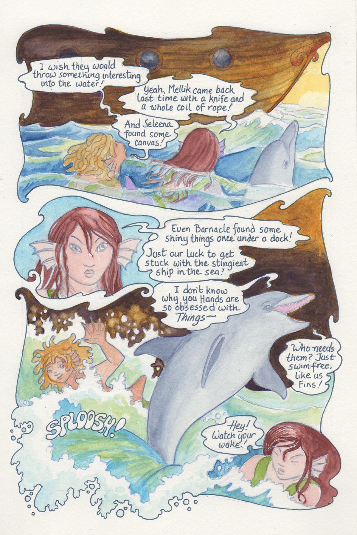
Here is the finished painting. After satisfying myself that the colours and values worked as well as I could get them in watercolour, I went back to the Col-Erase pencils. I re-outlined everything in Tuscan Red and Violet to sharpen up and darken the outlines (the pencils stand up admirably to watercolour, but the original Indigo was a little lighter than I wanted the finished outlines to be). I also added a little Purple to warm up the shadows in the ship, as my scanner was cooling it a bit too much, even with a bit of digital adjustment.
I didn’t crop this one as I did the others because I wanted to show off what a slob I am (see that purple smudge in the right margin? —won’t come out at all). Also, the paper tone is a warm grey compared to an absolute white (a little bit skewed in this scan because of paper wrinkling; even putting a couple of heavy books on during scanning doesn’t always get the shadows out). So now, for a bit of digital magic:

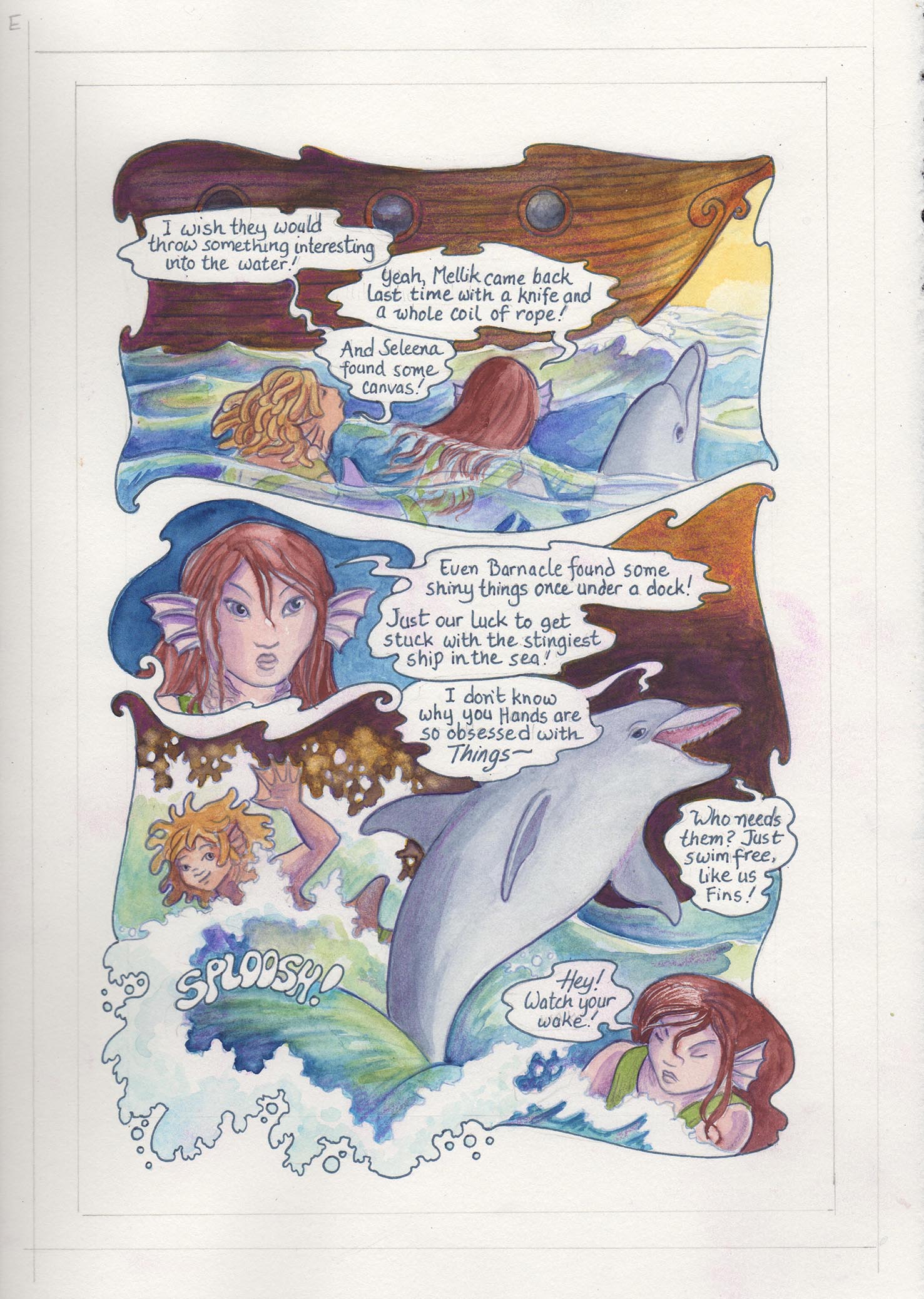
I LOVE Photoshop! First I selected all the outside of the borders with the Magic Wand Tool (set to 100, in case you want to know about that stuff). I selected Edit>Fill>Fill with white and Poof! nice white border, purple smudge all gone! Sometimes if I’m really a slob, I have to fix little areas individually with the Pencil Tool, but usually it works just fine. Then I went in and cleaned up each balloon, which is a bit more fiddly. My method (and there are different ways of doing this) is to select a white area inside the balloon with the Magic Wand, check in Quick Mask that the crawling ants aren’t escaping anywhere, then zoom in close and Magic Wand the insides of letters that are closed off. You might have to hold down the shift key to add to the selection; I have my setting set so the default is to add to the selection. Then I do the fill-with-white thing again, and it’s all cleaned up! You might have to mess with the number you set the magic wand to, depending on how much difference there is in the value/colour of what you’re selecting VS the border value/colour.
After the cleanup, I routinely adjust the Levels (command-L on a Mac, otherwise Control-L, or under adjustments in the image menu) by pulling the left (dark) slider over until it meets up with the first bit of black at the foot of the little mountains (yes I know it’s called a histogram but it makes me happy to think of them as mountains). This is because my scanner’s bright lights tend to wash out the colour a bit, and there’s always a white gap on the dark end. I don’t worry about separating the RGB channels for this, it’s just a tiny tweak to darken it up all around.
Now comes the fun part. I use the brush tool to add white highlights wherever I think I need them. One of the drawbacks of watercolour is that white paint (or marker) just does not cover without soaking up some of the colour you are putting it on; it can mess up the layers underneath as well. So the ability to do this in Photoshop is something I’m using more and more. I really like the effect, and the fact that it’s totally controllable and reversible. Since my comics are made to ultimately be digital objects anyway, I don’t worry as much about having the actual object be the final version, though I try to take it as far as I can with traditional mediums.
I hope you’ve enjoyed this journey through the making of a comic page! If you want to know more about what’s happening in the story, you can read the whole comic so far online at Mermaid Music!

Karen, your narrative and sequence of drawings was so instructive. Thanks for sharing your complete process, I enjoyed your post very much!
LikeLiked by 1 person
Thank you, Sharon! I’m glad you liked it! I’ll try to do more of these — it’s hard to remember sometimes when I’m in the midst of painting to stop and make a scan before I get carried away.
LikeLiked by 1 person
Tremendous work, Karen! Thanks for all the technical details too, I find it so amazing that even though I am an artist too, I don’t fully appreciate all the little nuances that go into a work like this, so it’s nice to have it all pointed out. Never fails to astonish me that you fit so much work into a 24 hour time period. Maybe Iris has a magic “more hours in a day” wand?
LikeLiked by 1 person
You’re welcome, and glad you enjoyed it! I think we all benefit by showing what goes into the making of a work of art. Most people only ever see the finished piece and have no idea of the hours and accumulated skill (practice, practice, practice!) that goes into any creative work.
As to the time, it took me almost as long to make this blog post out of it as it did to paint the piece! Total painting time (not including the drawing — as you know, a good drawing is half the battle): about four hours. plus an hour for the digital touch-ups. The drawing part: about an hour and a half for the initial drawing, and the same for inking/coloured-pencilling. So around eight hours total, about my average. A full day’s work.
LikeLiked by 1 person
Reblogged this on My Blog and commented:
This is a great behind the comic, on how to create lovely art.
LikeLike